Wynn Resorts
An academic case study exploring how modernizing the Wynn Resort’s mobile app creates a desirable digital extension of this iconic Las Vegas brand.

TIMELINE
January - March 2019
PLATFORM
iOS Native App
ROLES
Research, Product Strategy, UI & UX Design
TEAM
Independent
OVERVIEW
From Academic Assignment to an App Reimagined
During a recent trip to Las Vegas, I discovered that one of my favorite resorts had an app that did not match the stellar experience that the Wynn provides to its guests. By chance, an academic assignment presented an opportunity to analyze and improve any digital product, so I decided to take on the iOS extension of this iconic Las Vegas brand. The project was designed for students to gain experience in evaluating the usability of an existing product, translating insight into an improved user experience. The following case study demonstrates how the Wynn Resorts app was redesigned to delight guests before, during, and after their stay at the resort.
Disclaimer: Please note that I am not affiliated with the Wynn Las Vegas in any capacity, and the views presented within this case study are strictly my own.
THE PROBLEM
A Frustrating App Defeats Its Intended Purpose
The Wynn Resort app is frustrating, confusing, and unintuitive. The user is often led to unexpected areas of the product, and its limited features serve little purpose or value to the user. Within the app, potential customers are prompted to call the front desk for reservations—leaving the Wynn vulnerable to losing potential clients to competing resorts that offer more accessible and faster bookings. To add to the frustration, three separate apps are required to access features of the resort, casino, and onsite clubs and entertainment. The Wynn is universally recognized as the number one luxury destination in Las Vegas and is the winner of the most Forbes Five Star awards in the world. The digital extension of this iconic resort is a clear setback for the Wynn brand.
DESIGN CHALLENGE
How might the Wynn Las Vegas apps be re-designed for a global audience to enhance the user experience and improve brand sentiment?
THE SOLUTION
A World-Class App for an Iconic Brand
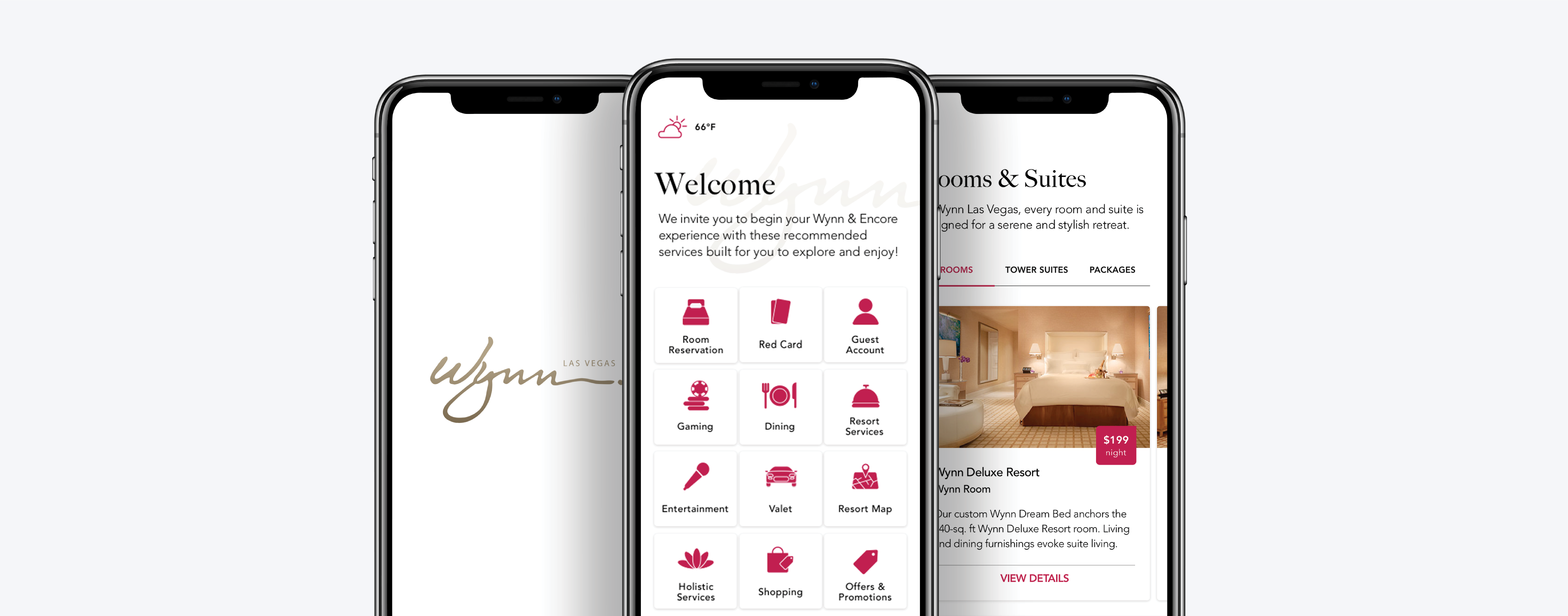
Introducing the new Wynn Resorts mobile app for the iOS platform. The new iteration of the brand’s digital offering aims to match and exceed the lofty expectations placed upon this internationally revered name. This app is relentlessly focused on customer service, customer convenience, and choice—while revolutionizing guests interaction. With seamless check-ins/outs, a personal connection to the Wynn’s concierge service for guests, and features allowing non-guests and local residents to purchase show tickets and make dinner reservations, the app is unapologetically Wynn in its ability to provide an exquisite experience.
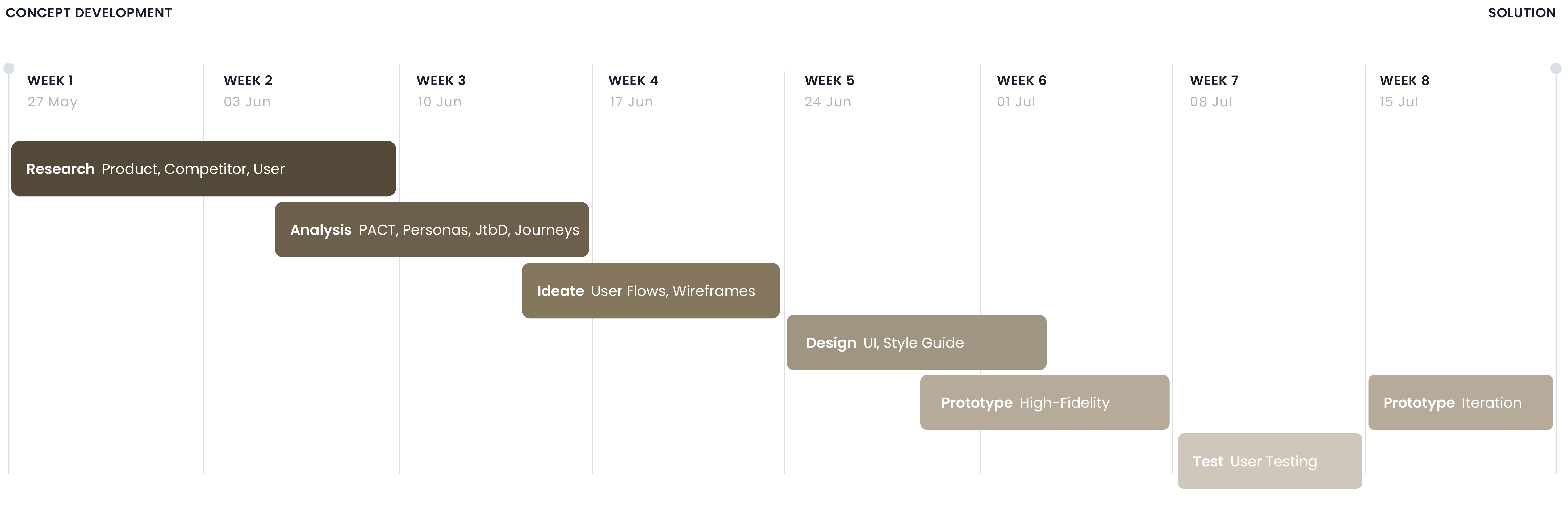
PROJECT SCOPE & TIMELINE
Mapping Requirements to Ensure Project and Product Success
To facilitate project planning, a scope and timeline were created at the outset of the project to ensure all requirements and deliverables were defined and accounted for. This acted as a visual roadmap, allowing for milestones and deliverables to be identified, tracked, and prioritized. The project consisted of four stages: the initial research and analysis, product strategy and feature ideation, user experience and brand design, and product prototyping with usability testing.
DESIGN PROCESS FRAMEWORK
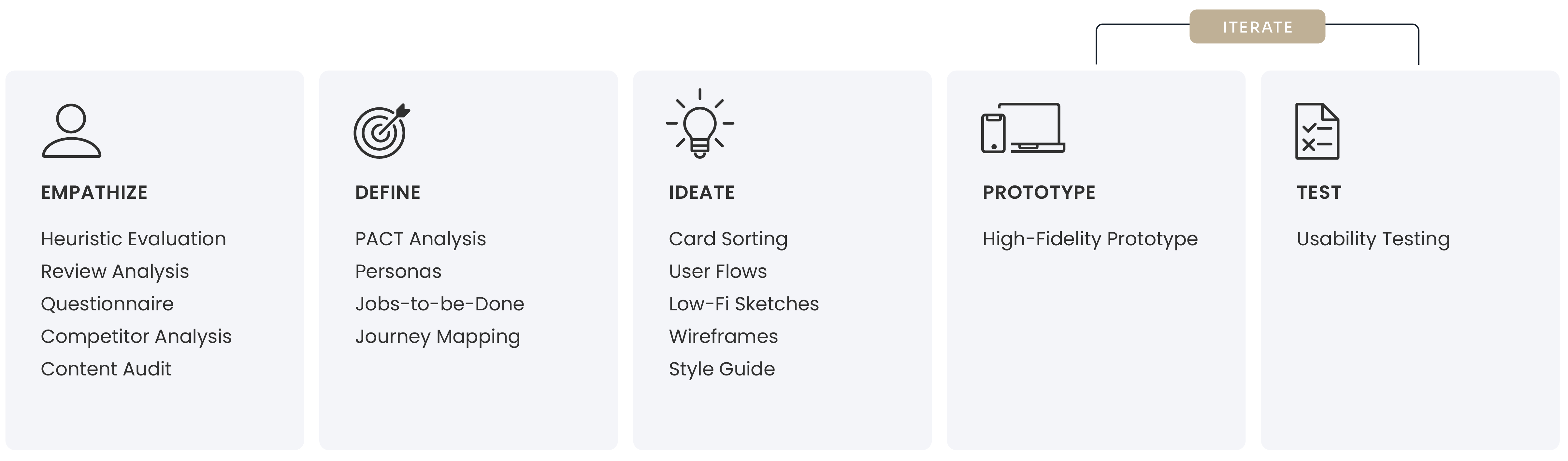
Creating Impact Through the Stanford d.school Model
Using a human-centered, design thinking approach, the Stanford d.school model was adopted. This helped to identify, dissect, and ultimately devise solutions to the problems at hand. With the goal of providing an outstanding guest experience, and an app that will leave an impactful impression, this design framework was optimal for guiding the research and process.
TOOLKIT
Intentionally Selected Tools to Achieve an Outstanding User Experience
The tools utilized for this project were selected for their ability to support the process in its entirety–from conducting research, organizing insights, ideating solutions, prototyping and design, up to the testing and iterating stage–finding the right tools and learning how to use them was key in achieving the desired user experience. I also opted for tools that could be used to explore animated interactions, such as Principle, and relied heavily on tools that allowed for remote user testing to ensure the product could be tested by former guests who understand the feeling and experience the app is intended to invoke.

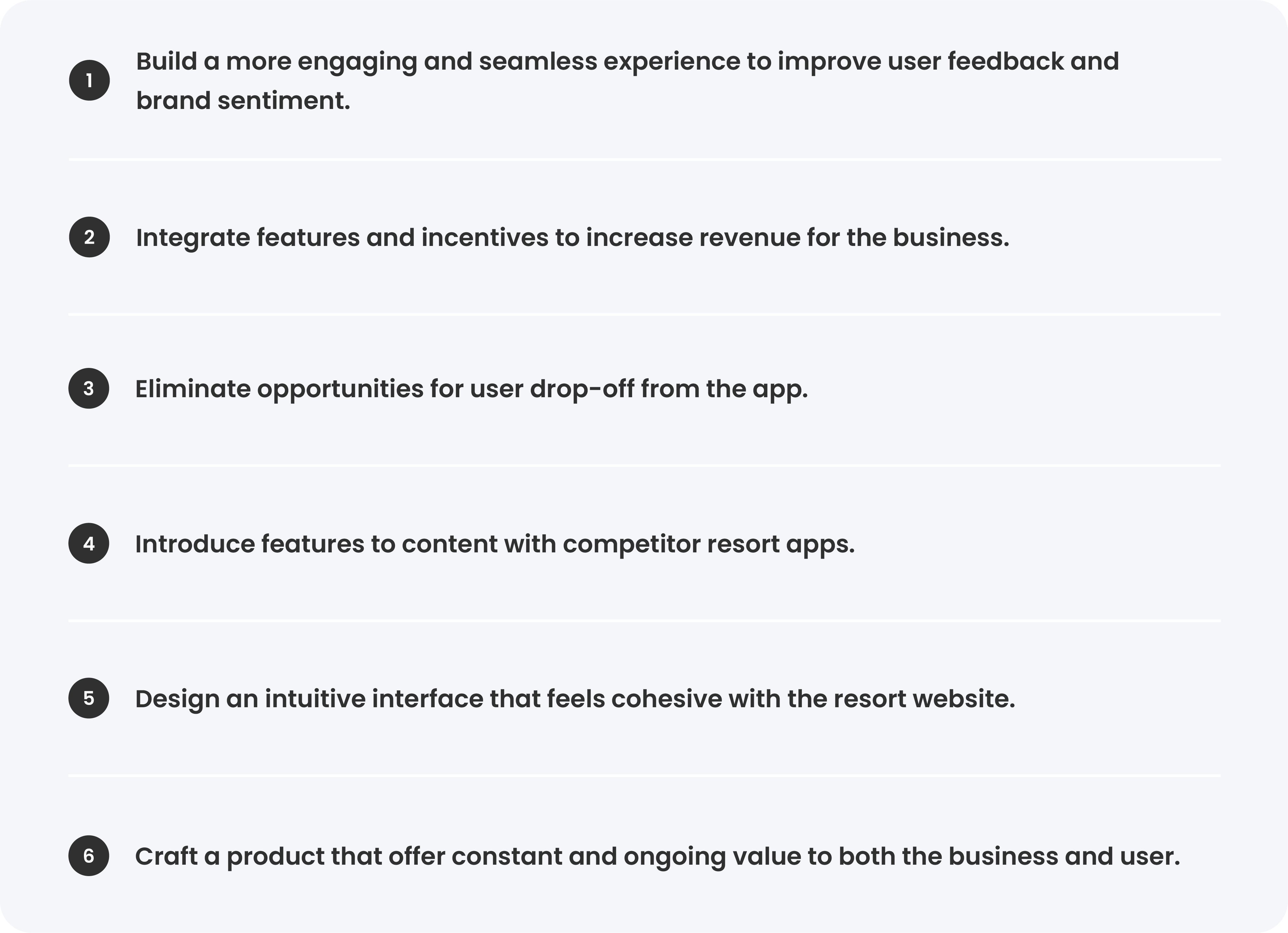
GOALS & OBJECTIVES
Creating a Digital Experience in Step with the Resort Itself
From the outset of the project, having defined goals and objectives was key to ensuring the outcome exceeded the intentions and expectations of the project. The high-level goal was to create a scalable and sustainable product with the potential to enhance the guest experience, grow brand loyalty, and increase revenue for the business. Further to this, creating a fully interconnected, seamless experience between resort, casino, and entertainment facilities by discarding three subpar apps and creating one overarching app was key. Crucial to the success of the project was that the end product not only supports guests during their stay—but at all stages in their Wynn journey–before, during, and after their stay.

Empathize
HEURISTIC EVALUATION
Established Heuristics Reveal Opportunities for Improvement
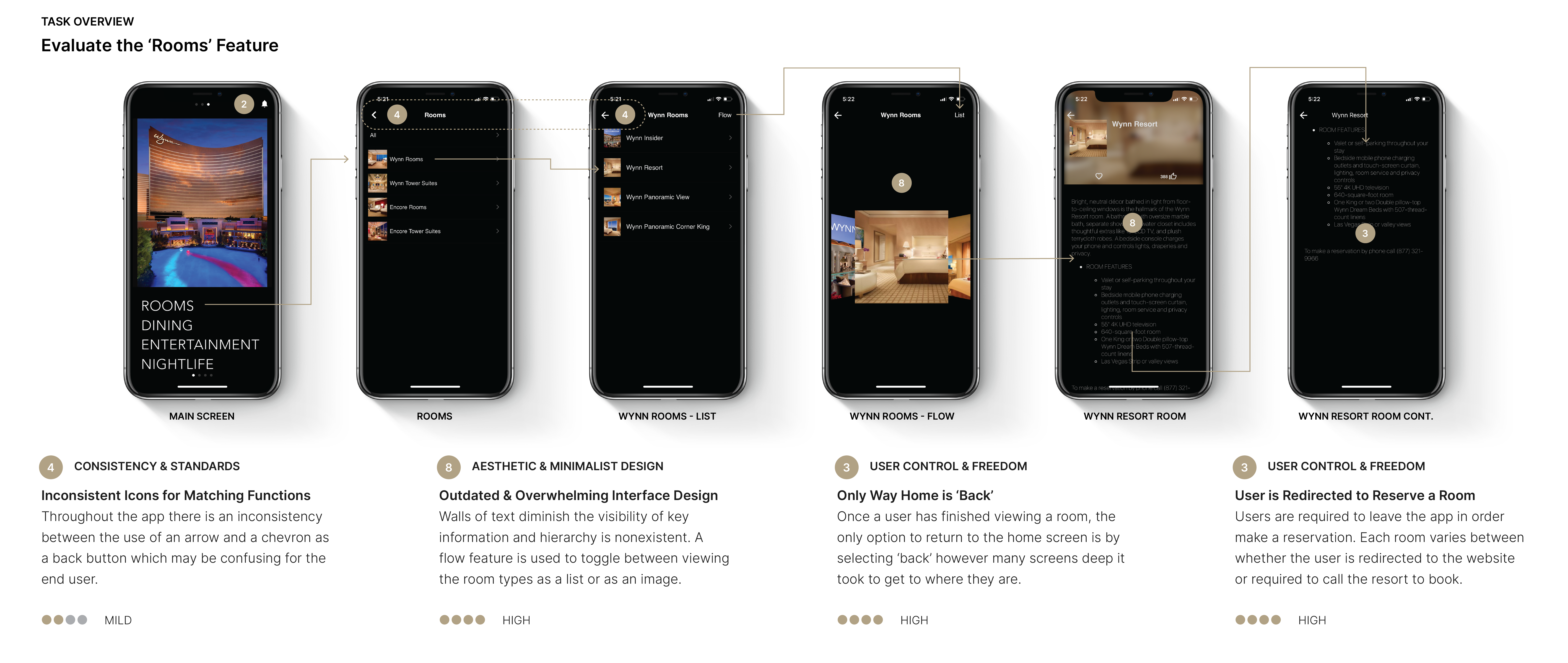
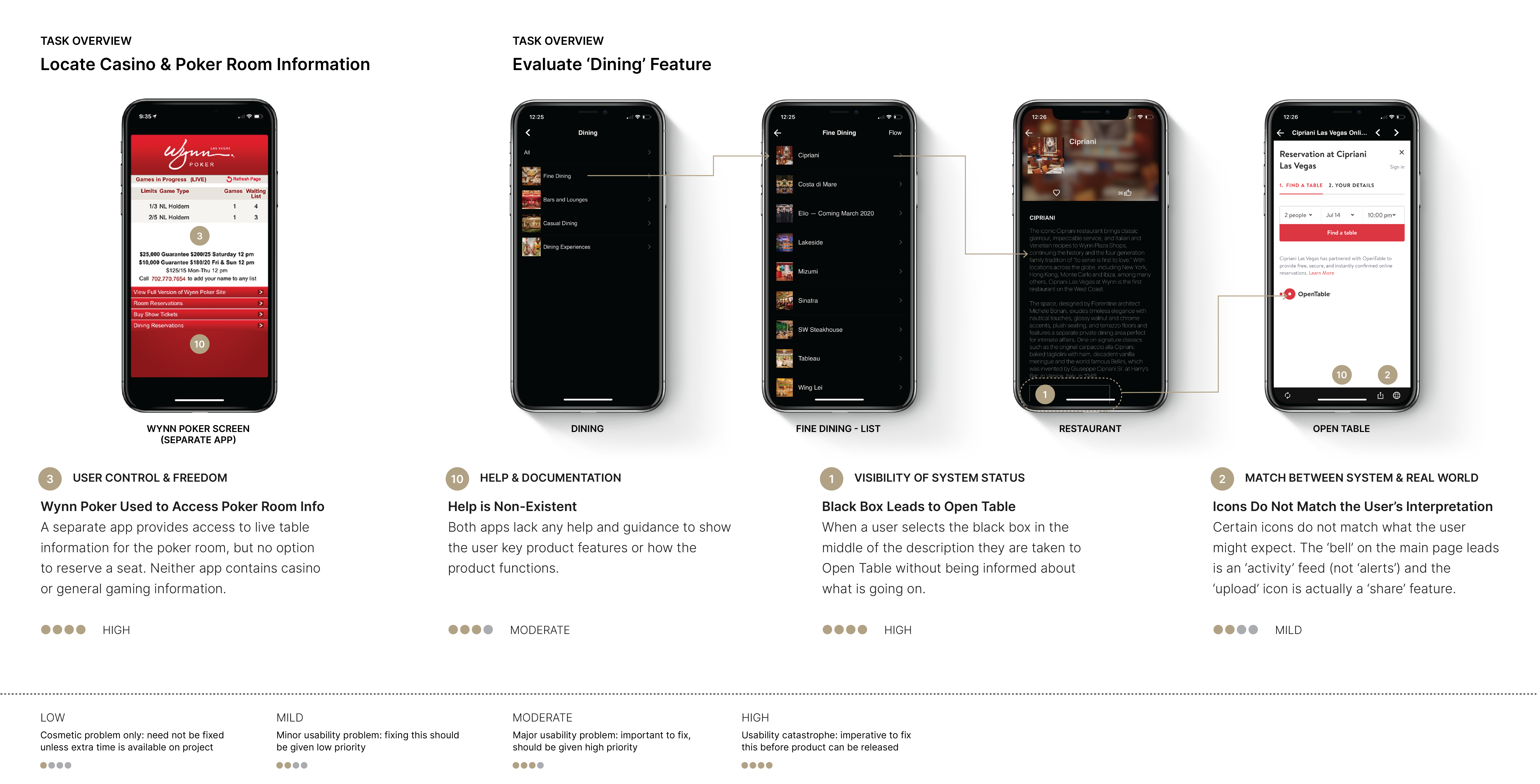
An heuristic evaluation of the app was performed at the outset to establish a baseline upon which a foundation could be built. This was done using Nielsen’s 10 general principles to measure the usability of the design. The evaluation was conducted using walkthroughs and key tasks that I found challenging when using the app during my stay at the resort. This included finding room and reservation information, viewing dining options, and locating poker room information. Established heuristics revealed multiple high-level errors that became the basis of identifying opportunities to enhance usability and overall experience.
USER REVIEW ANALYSIS
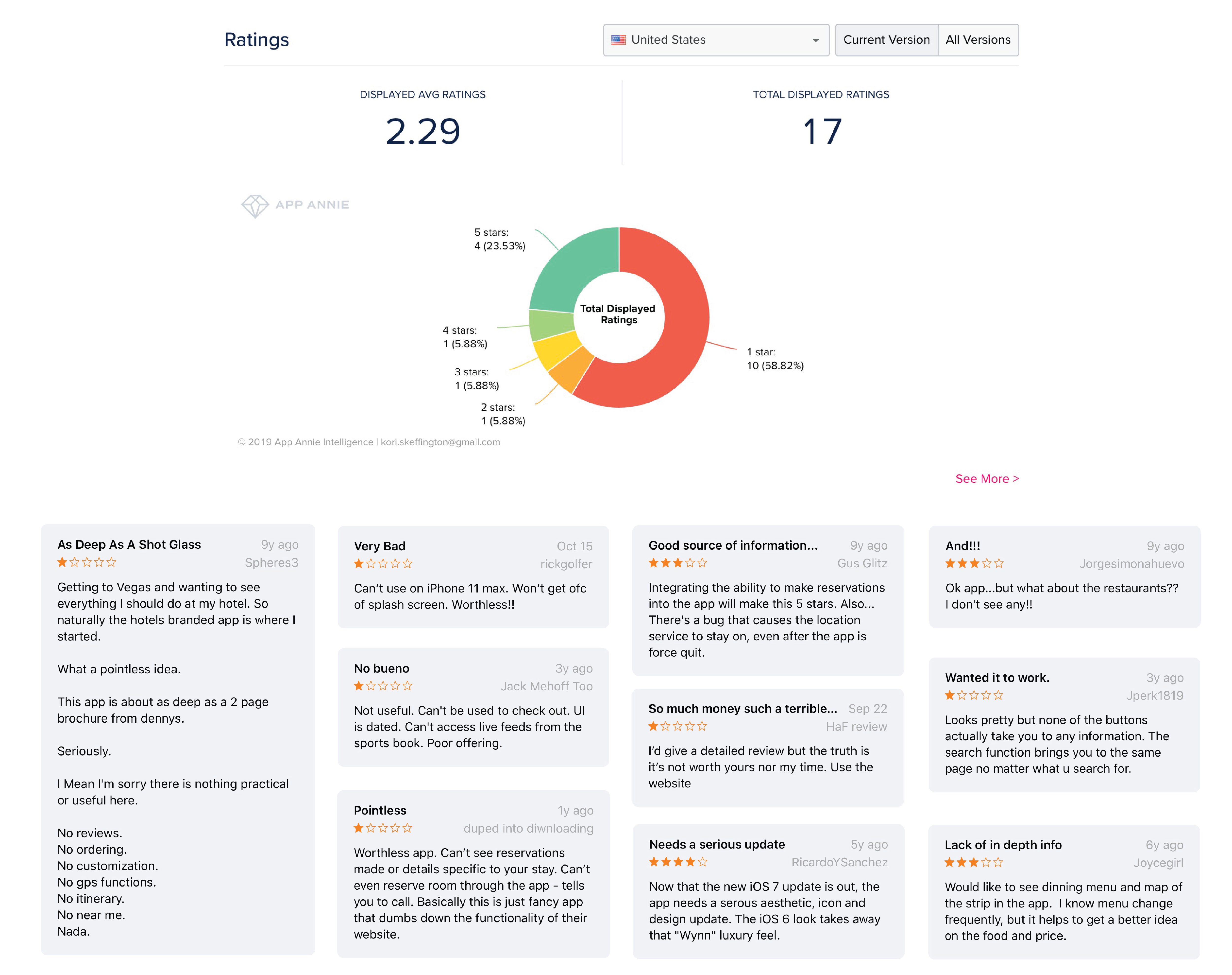
App Store Reviews Reveal Pain Points To Be Addressed
User feedback was gathered from reviews posted to the US and Canadian App Stores and information available through App Annie. This provided clear insight into areas where users were encountering issues with the current product. While the general consensus of this information indicates that the app delivers more friction than function, several reviews noted suggestions for features they would like to see. These user-generated insights helped to establish the initial product requirements and gain a deeper understanding of customer wants and needs.
QUESTIONNAIRE
Guest Insights Reveal Habits and Expectations
The next step involved using a Google Forms questionnaire to engage with travelers and Las Vegas residents to discover how likely they are to use a resort app, what their travel habits are, competitor products they use, challenges they've encountered, and what features they feel could be useful. The questionnaire was distributed using SurveyCircle.com and Reddit via the r/LasVegas and r/SampleSize groups which attracted responses showing that more than half of the respondents felt that most resort apps have little purpose for the user once their trip is over. There was a clear indication that the redesigned app had to serve the user on an ongoing basis, rather than being a novelty product whose usefulness ran dry after a matter of days.
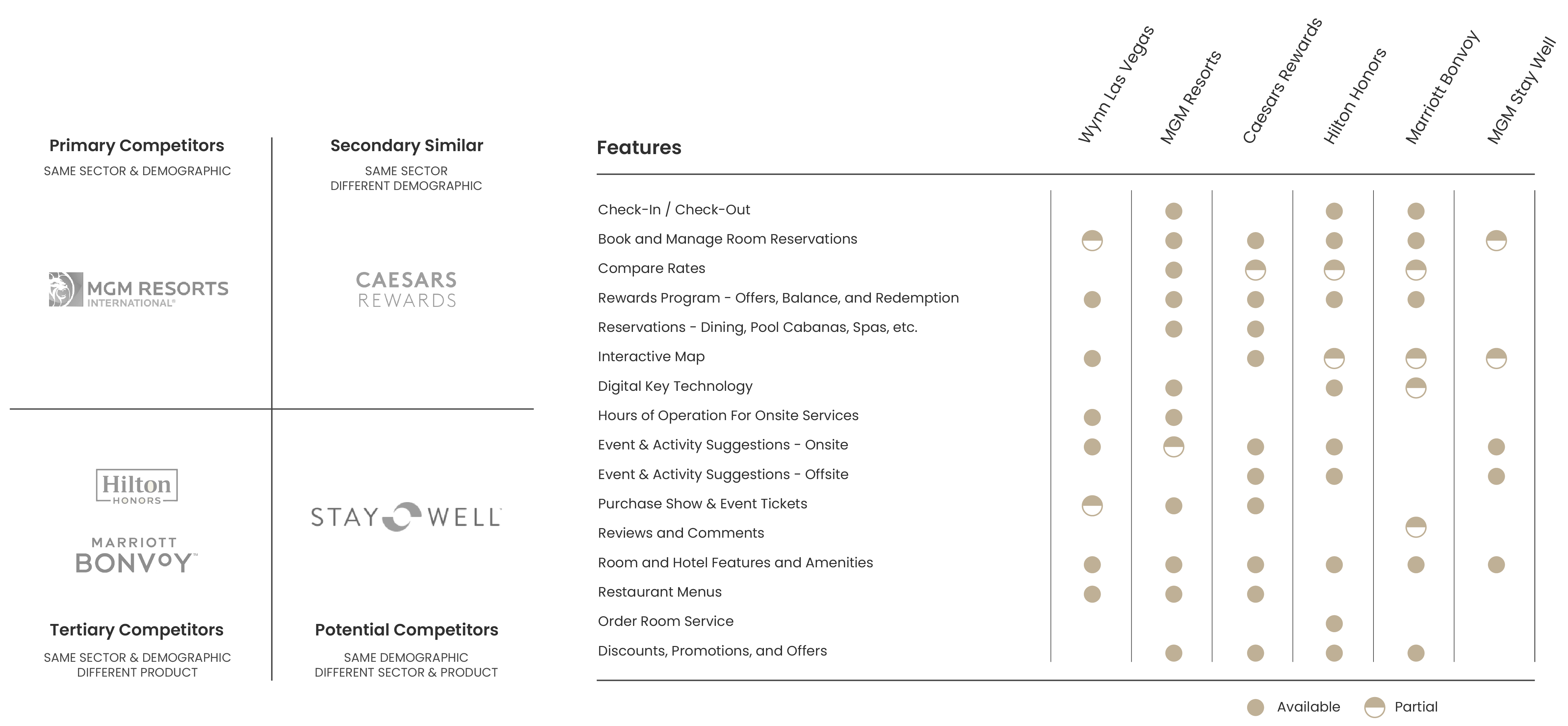
COMPETITOR ANALYSIS
Analyzing Competitor Resort Apps to Identify Opportunities for Market Gains
Leaning on insights gathered from the Questionnaire, competitor resort apps were analyzed to provide deeper insight into how the Wynn app currently stands compared to apps available from other resort properties, both on and off the strip. This analysis considered the visual treatment, product features, value proposition, and overall user experience to identify the strengths and weaknesses of each product. This not only showed what that competition is doing well and what features could be integrated to enhance the Wynn’s digital experience, but also highlighted common features that users are likely to anticipate today.
CONTENT AUDIT & MAPPING
Breaking Down Three Apps to Build One
Considering each of the three existing Wynn apps were to be overhauled and later merged, a high-level audit of these apps was crucial. This identified where gaps exist and began uncovering opportunities for improvement. Prior to this, the Wynn had also launched an updated website. This was also audited to ensure cohesive branding and experience for the user. Using the analysis and questionnaire as a guide, I established which features were to be included or omitted, and identified redundancies.


Define
PACT ANALYSIS
Context is Key When Shaping Design
A PACT Analysis was used to organize contextual insights into logical, cohesive groups systematically. This includes the People, Activities, Contexts, and Technologies being accounted for as part of this redesign. Understanding who the users are, what activities are carried out, what the interactions are, and what technologies are used illuminated areas where new product features could generate brand loyalty and improve sentiment. This helped clarify the research gathered and draw connections between individual elements to develop new and deeper insights used to define the problem and develop ideas for solutions. The PACT analysis shaped the purpose, values, and fundamental characteristics that would make this a successful redesign.
JOBS-TO-BE-DONE
Using Jobs Theory to Create a Predictable Guest Experience
Armed with an understanding of the people who might use this product, and in which context they would do so, the Jobs-to-be-Done framework categorized, defined, captured, and organized the needs of the Wynn’s guests. Strategy was then aligned with my understanding of customer needs. This expanded my view of the market, creating actionable insight.
PERSONAS
Modeling Users Through Storytelling
Drawing on research insights, four goal-based personas were created to represent each of the core user groups this product is being designed for. These include: the business traveler, the family, the couple who enjoy a quick weekend getaway, and the local resident. Distilling insights into a series of personas helped guide the product strategy toward a more impactful and user-centered digital experience. One that empathizes with the needs of those that will engage the product and benefit from its use.
JOURNEY MAPPING
Locating and Addressing Friction
The creation of customer journey maps provided a visual narrative of each personas actions, feelings, perceptions, and frame of mind as they interact with the app. This map included the positive, negative, and otherwise neutral moments experienced by the users during the product’s use. Journey Maps allow us to clearly identify friction points, giving us a framework within which we can track what led to these moments. This is where innovation should occur, and did in the case of this project. The Journey Map precipitated the identification of opportunities to broaden offerings and foster user interaction and communication.

Ideate
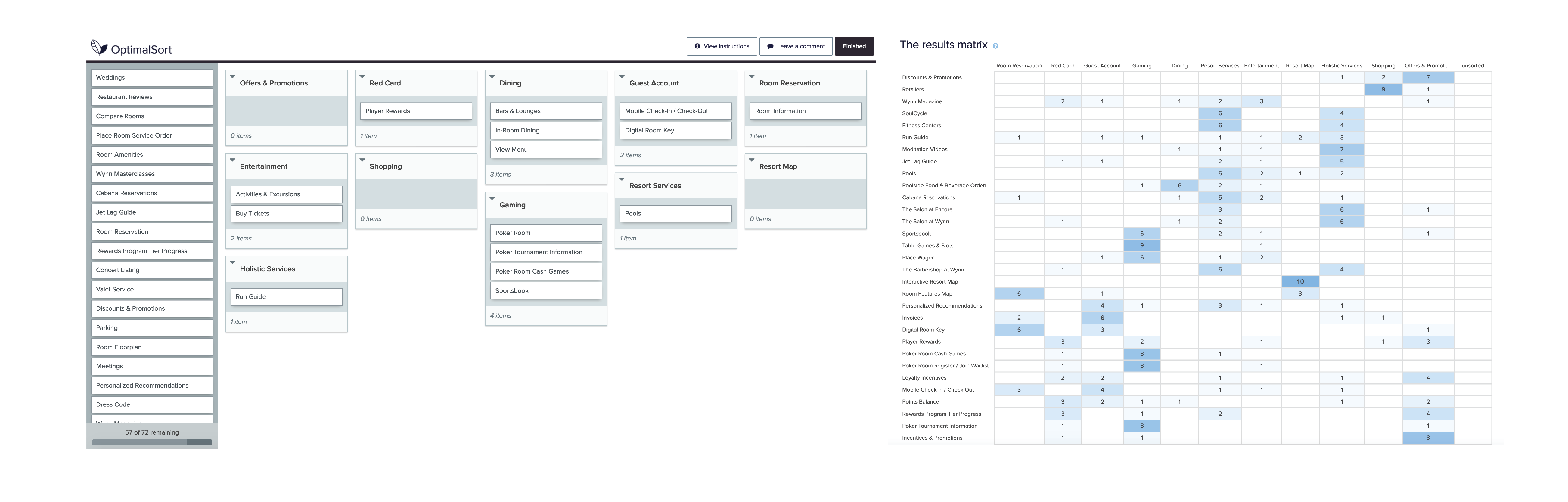
CARD SORTING
Feedback Leads to Intuitive Feature Organization
Using OptimalSort, a remote card sorting study was created and distributed using SurveyCircle to attract participants aged 21+ from around the world. This approach was used to understand how people might associate and organize different features within various categories. In other words, where they would instinctively go to find a specific feature or information. This helped guide the design of the menu structure and information architecture to ensure key information is easy to find, intuitively meeting users' expectations.
USER FLOWS
Crafting Frictionless Navigation for the Mobile Experience
This stage of the process is where disparate puzzle pieces begin to create a cohesive site structure. This structure is intended to support users’ goals in as few keystrokes as possible. This set the stage for improvements in the discoverability of key features, how product interaction could work, and frictionless navigation.
LOW-FIDELITY SKETCHES
Quick n’ Dirty Sketches Enable Rapid Testing of the User Flow, Functionality, and Error Detection
With the site structure in place, low-fidelity sketches were generated to map out the different screens and user flows for each job story. An interactive prototype was created using Marvel's POP app to work through the logic of how the content and navigation should flow. Using campus staff as participants, preliminary user testing provided quick insights into the users’ interactions and reactions to the product, their responses to various features integrated into the design, and whether or not they could complete key tasks quickly and with ease. The outcome of this early testing phase showed where changes needed to be made, such as an easier dinner reservation process, and which the tools are best suited for the tab bar along the bottom. Comments were also made about the position of the guest check-in option which initially I felt was a great tool implemented by other resorts, but people who tested the app felt it could be placed under a guest account option instead.
WIREFRAMES
Creating a Functional Skeleton to Collect Expert Feedback
Wireframes were created as an extension of the low-fidelity sketches to show the fundamental structure and functions of the product. These blueprint screens provided a foundation upon which to express, reflect on, and communicate ideas for how the product should work. This process ensured that the core purpose of the app was usable without surplus high-fidelity information. These mid-fidelity screens were used to seek feedback from more senior designers before turning them into a high-fidelity prototype.
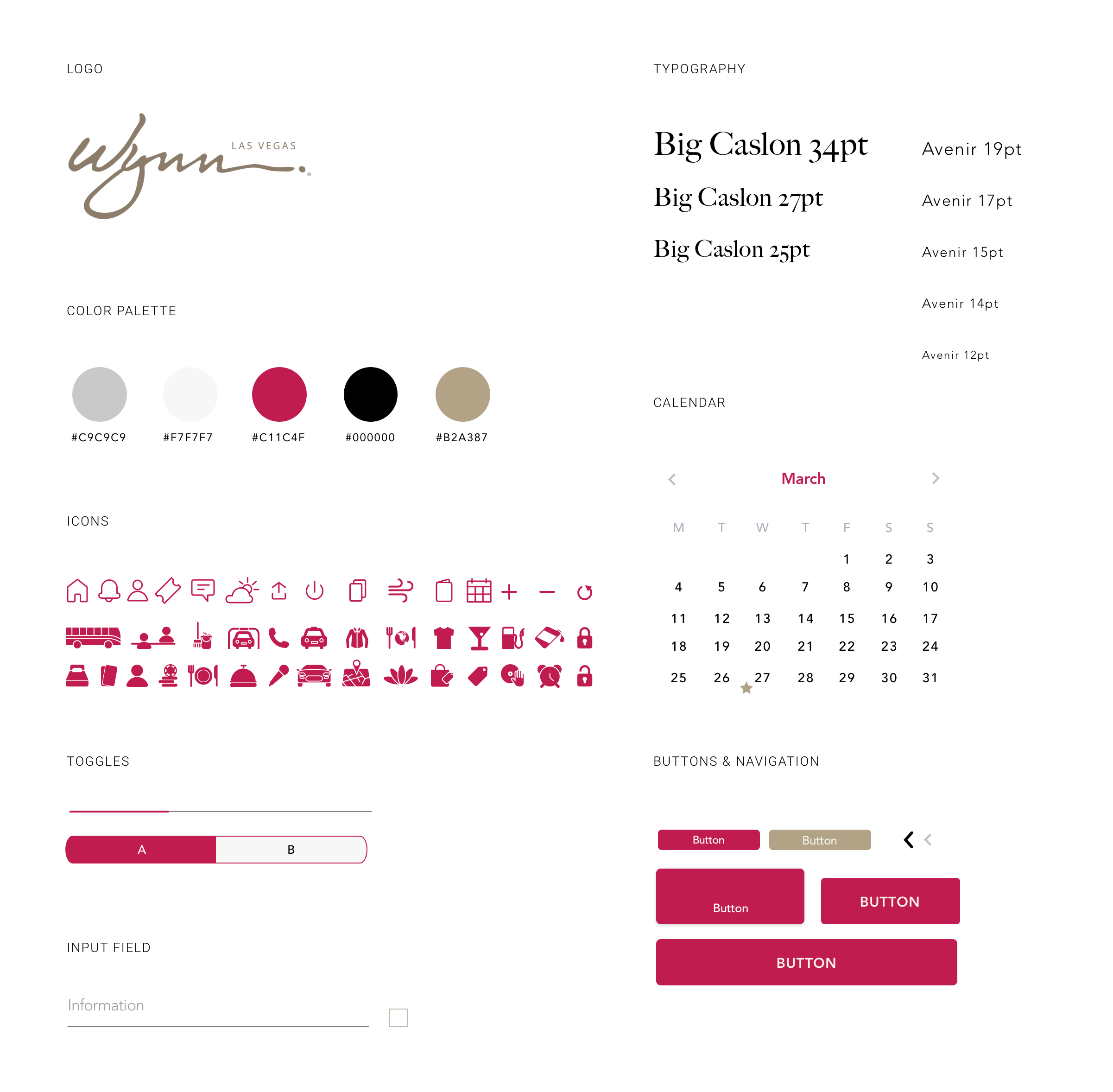
STYLE GUIDE
Branding That Matches the Wynn’s Prestige
The interface design was built to feel like a companion app to Wynn’s new website. To ensure seamless design component hand-off, a modular system based on reusable components was created. Within it, components can be rearranged and combined while maintaining brand and design consistency, as well as create recognizable UI patterns to the user.

Prototype
HIGH-FIDELITY PROTOTYPE
Prototyping Leads To Cohesive Design
Creating a high-fidelity prototype provided a tangible artifact that was used for testing ideas and gathering feedback with potential users. It was also used as a personal playground to experiment with Principle to explore interactive transitions and animations. The design pulls together elements from the Wynn’s website for a cohesive feel, delivering a personalized, modern, and elegant experience—something familiar to guests of Wynn properties.
Test
USABILITY TESTING
Lorem ipsum
User testing via Useberry provided an opportunity to discover design flaws within the first iteration of the product. Testing tasks were:
Outcome
KEY FEATURES
A Newly Designed Product to Enhance the Wynn's Digital Persona
With seamless check-in/out and a deeper connection to all Wynn’s core services and entertainment offerings—the redesigned product allows guests to intuitively navigate the Wynn through technology. Alongside these enhancements, the product also serves a utilitarian purpose for non-guests by serving as a simple method of purchasing show tickets and making dinner reservations. At every stage of a user’s interaction with the Wynn brand, this product delivers a desirable experience. Generating new business, improving brand sentiment, growing brand loyalty, and augmenting guests’ overall experience are both the goal and byproduct of these new features.
Simple Room Reservation with Engaging Features
Customers are no longer redirected to the website or prompted to call the resort to make a room reservation. The new design provides customers with detailed amenity information, accommodation photos, as well as an interactive room features floor plan.
Quick Check-In with Mobile Key Technology
Digital Key is a convenient option for resort guests to access their room within minutes upon arrival. Guests now have the option to use their mobile device to conveniently unlock any door that would typically be opened with a key card, from their room or suite to the fitness center and more.
Dining and Reservation System
Deciding where to eat can be a tedious task, especially with more than twenty different options to choose from between the Wynn and Encore resorts. To help guide the guest's dining needs, this newly designed product offers suggestions based on mood, time, experience, and more.
Personalized Concierge Assistance
Designed with the needs of busy guests in mind, this personalized concierge service allows the customer to message specific areas of the Wynn's concierge service within the app. From housekeeping to wake-up calls, or even special requests, guests are now able to converse with the right representative whether they're waiting for their luggage at the airport or getting in an extra hand at Blackjack at the casino.
OUTCOME
Glowing Reviews from Industry Professionals
Feeling good about the outcome of the design, I decided to submit it to the RGD Student Awards where it won the Quarry Awards for UX Design, as well as an honourable mention under The Works Award for Visual Web Design category.
LEARNINGS & TAKEAWAYS
Complexity Necessitates Creativity
Each project is an opportunity to learn, adapt, and grow. An opportunity was presented to take an existing product and reimagine what it can and should do. As creative strategists, the onus is on us to integrate the human element into our approaches to design. Solutions that favor business, client, and brand in equal measure are necessary in an age of increasing adoption of technology. Delighting the user with one single app that achieves their goals is exponentially greater than disappointing users across multiple apps.
Redesigning an existing product adds a layer of puzzle-solving to design complexity. Certainly, a globally recognized brand is under pressure to perform at every level of business and service, including in their digital offerings. With a name like Wynn, expectations are amplified. In order to meet these user demands, a product has to meet user assumptions while exceeding demand and expectation by leaps and bounds.
Final Conclusions Drawn:
Premiere brands require exceptional offerings
Meet assumptions while exceeding expectations
The human element is a key ingredient in any design
Redesigning means reimagining possibilities
KORI SKEFFINGTON
© 2021 All Rights Reserved
CONTACT
SOCIAL