Ford Adventure
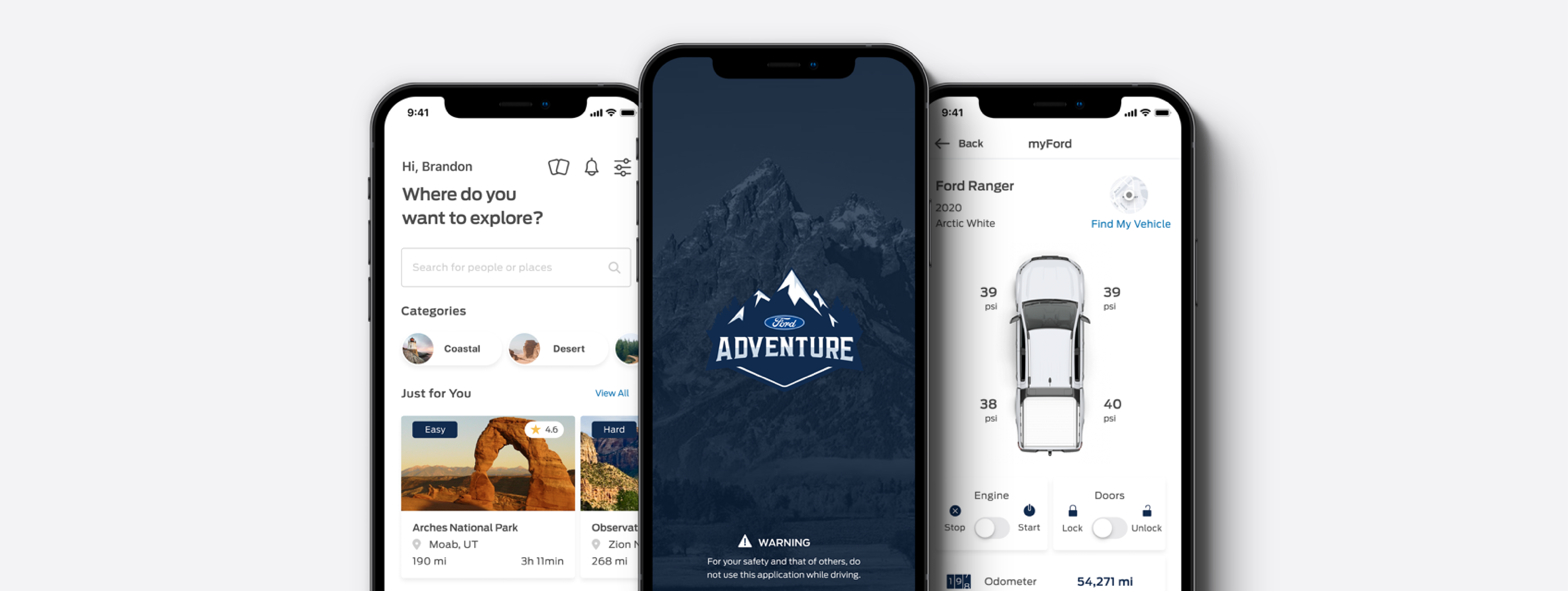
A product designed to encourage drivers to get outside and explore the world around them using their Ford vehicle
TIMELINE
June - July 2021
PLATFORM
Mobile Web Application (v.1) & iOS Application (v.2)
ROLES
Research & Analysis, Product Strategy, Branding, UI & UX Design, Usability Testing
TEAM
Shrikant Kakaraparthi (Fullstack), Matt Wood (Front-End), Pushkar Mungikar (Ideation)
OVERVIEW
Ford Inspires Connected Vehicle Innovation Using the New FordConnect API Technology
Advances in vehicle connectivity are transforming the way in which we engage with our vehicles and the experience of vehicle ownership. The automotive industry is no longer about providing the hardware to move us from point A to point B, but to provide the hardware, software, and experience that is changing how we stay connected. To explore and inspire innovative ways to utilize this technology, the Ford Smart Vehicle Connectivity Challenge was launched giving participants from across Canada and the United States an opportunity to resolve pressing driver pain points using the new FordConnect API. Together, our team worked together to reimagine how this data-driven technology could be used to create a product that improves people’s lives and offers drivers a better Ford experience.
THE PROBLEM
Spending More Time Indoors Negatively Impacts People’s Mental & Physical Health
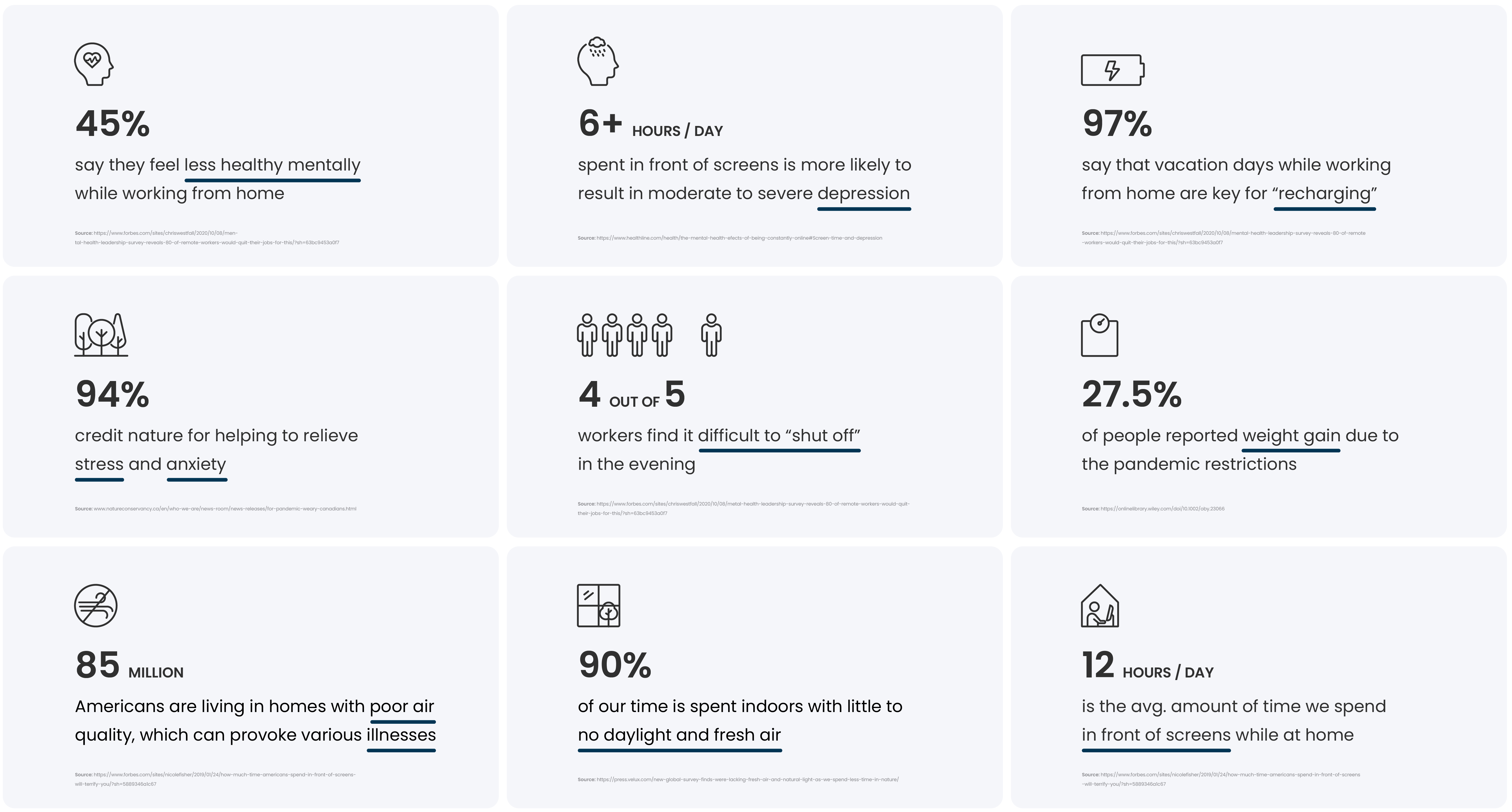
Every morning, the routine looks the same: Wake up, brew some coffee, walk over to your desk, and spend the day tapping away while intermittently checking your smart device for updates from the “outside world”. While modern amenities have undoubtedly made life easier on many accounts, spending more time indoors has been shown to have a negative impact on our mental and physical health. A recent YouGov study reports that 90% of our time is spent indoors with little to no daylight and fresh air. Today, 84 million Americans are currently living in homes with inadequate air quality, which can provoke illnesses ranging from headaches and sore eyes to allergies, asthma – and worse. Lack of direct sunlight also leads to vitamin D deficiency, which research links to fatigue, low mood, anxiety, and depression. The consequences that arise from modern society’s vanishing relationship with the natural environment prompts an urgent need for a solution to encourage people to get outside and escape from the confines of home.
DESIGN CHALLENGE
How might we alleviate mental and physical health challenges so that we can build and support communities of healthier, happier people to avoid adverse outcomes for the future?
THE SOLUTION
The FordConnect API Opens Doors to Encourage Drivers to Explore Their Local Communities and Beyond
As fellow human beings and technology enthusiasts, we identified an opportunity to utilize the FordConnect API to create a product designed to encourage people to take a break from the stress and the glow of screens at home to support better lifestyle habits and improve mental and physical health outcomes. Ford Adventure is a mobile solution designed to encourage drivers to explore the beauty of their local communities and beyond using their Ford vehicle. Spending time in forests, hiking in mountains, visiting a beach, and just being outside can lead to significant health benefits which is helpful for our overall well-being. With a line-up of vehicles like the Escape, Expedition, and Explorer, the Ford Adventure app feels like a natural companion to the Ford lifestyle and customer experience.
ROLE & RESPONSIBILITIES
Complementary Skill Sets Come Together to Drive Connectivity Innovation
When we kicked off the project we initially started off as a team of eight, including front-end, full stack, junior, and Android developers, software and systems engineers, a data scientist, and myself handling the UI/UX efforts. However, at various stages, our team began to taper off and we finished the project as a team of four. Together, we collaboratively brainstormed solutions and explored different user flows; and in my role, I led the research and analysis efforts, team workshops, branding and interface design, prototyping, and user testing.

PROJECT SCOPE & TIMELINE
Crafting a Clear Scope Upfront Leads to a Successful Outcome at the End
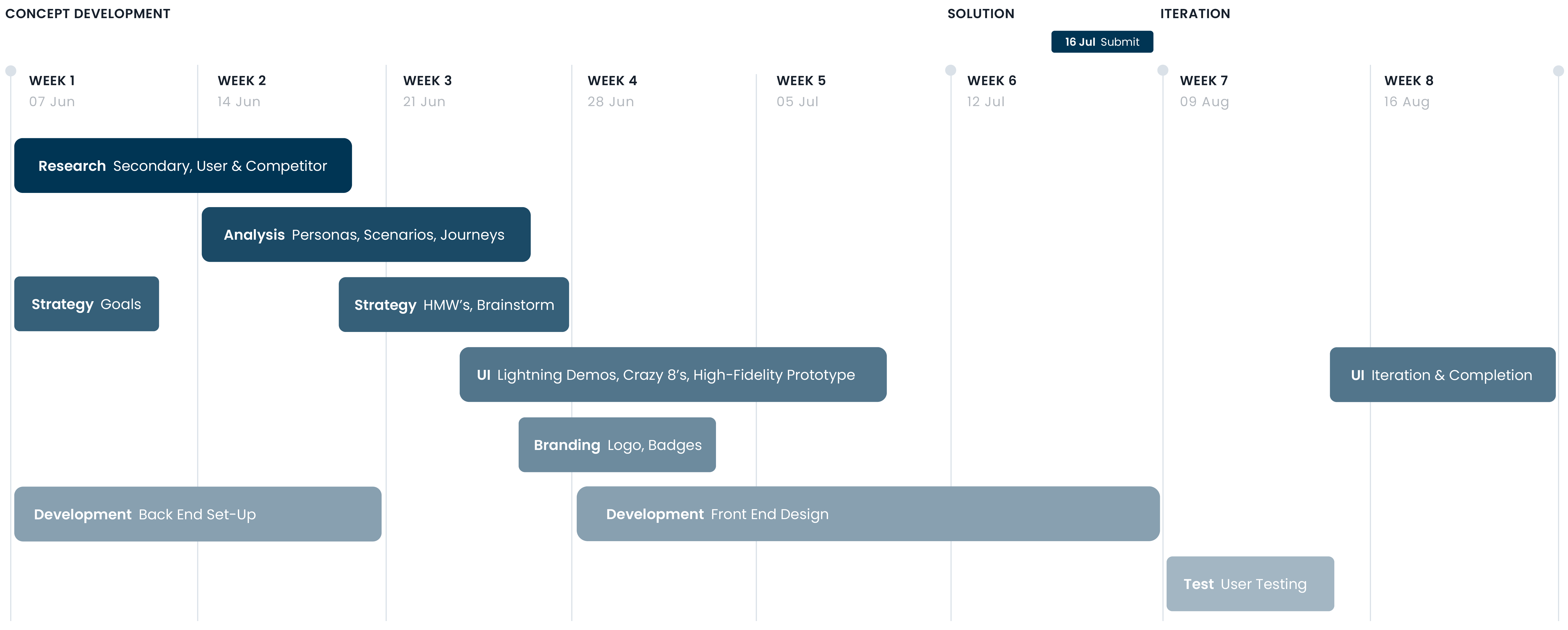
One of the limiting factors we needed to consider early on was the diversity in skill sets and how they could all be utilized to ensure everyone could add equal value to the project. It was decided that the creation of a web app along with a complementary native Android app would be the optimal approach to move forward with, not only ensure everyone could contribute equally, but to also allow our project to benefit from the differences both web and native apps can offer. Given the accelerated timeline we were faced with, and the ambitious deliverables we were looking to create, mapping out everything that needed to be done as early as possible was critical for optimizing workflow efficiencies.
DESIGN PROCESS FRAMEWORK
Developing New Product Opportunities Using a Design Thinking Approach
From start to finish, our team embraced a design thinking mindset to help us identify and develop an effective solution. The Stanford d.school model acted as our primary framework along with methods borrowed from the Google Ventures design sprint model to ensure brainstorming and design ideation was a full team effort. By keeping everyone involved and aware during each step of the process, we were able to ensure that the design and product requirements were well within everyone’s capabilities, and possible, given the tight timelines we were working with. This also allowed us to move swiftly into the development phase with few surprises.

TOOLKIT
An Array of Tools to Support Ideation, Innovation, and Performance
The tools used at every step of the design process were chosen for their ability to support teams working remotely, and to facilitate the research, analysis, ideation, creation, and implementation of the project. Familiarity was also an important factor when considering which tools to use in an effort to mitigate unnecessary learning curves that could prolong the design process and reduce the time available for the development of the project.

GOALS & OBJECTIVES
Defining Product Capabilities with Scalability at the Forefront
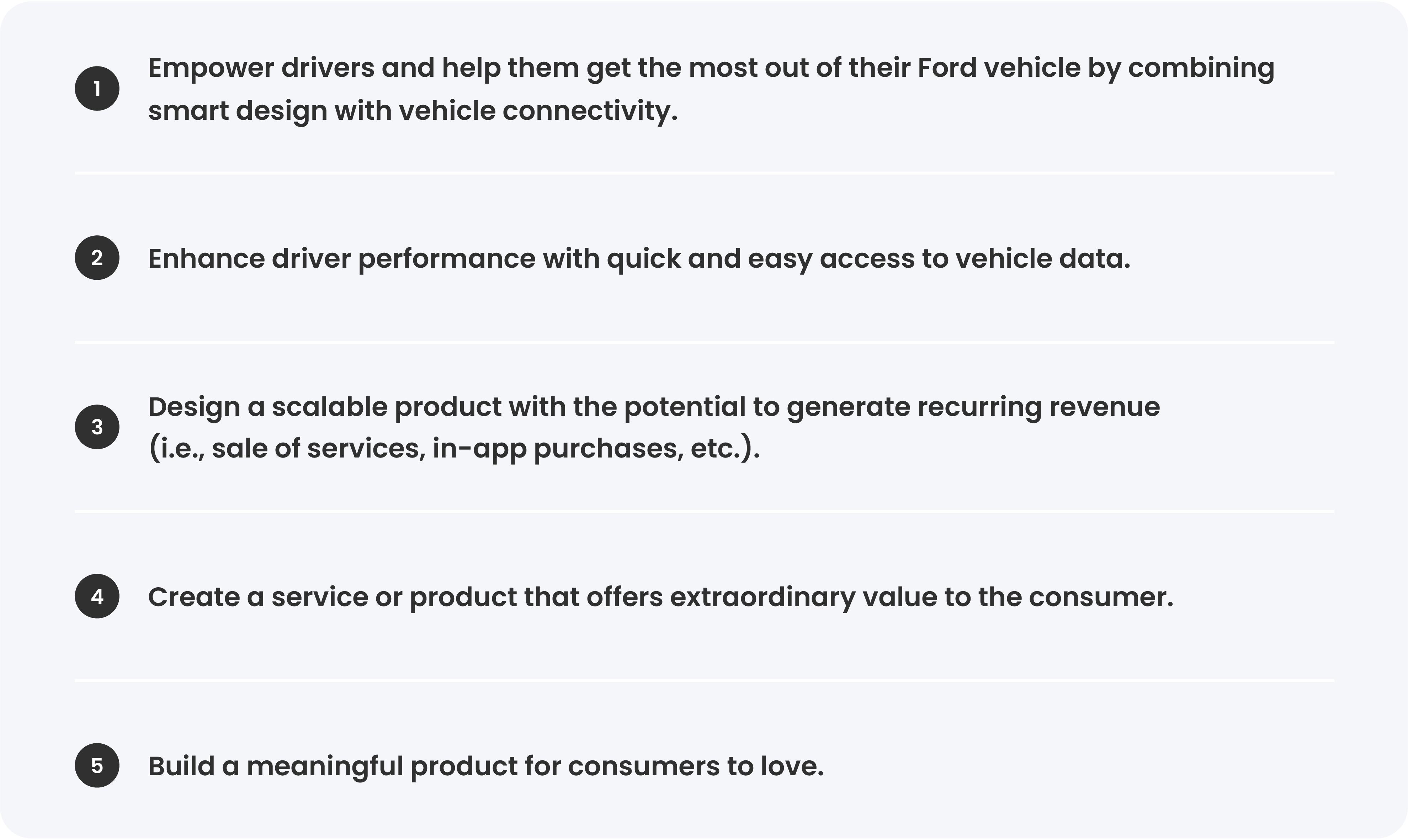
From the start it was important that we were all on the same page in terms of what we wanted to accomplish, and what we felt could deliver a high-value actionable business idea as our solution. Collectively, we discussed what goals and objectives we felt were important, and what considerations we needed to be mindful of as we worked towards optimizing the Ford customer experience. Identifying our common goals and objectives early in the process also provided a framework to reflect upon and guide decisions quickly throughout the fast-paced development cycle.

Empathize
SEGMENTATION ANALYSIS
Gathering Insights About Ford's Product Line to Identify and Understand the Market and Target Customer
Vehicle ownership is an intensely personalized and customized extension of ourselves. What we drive often reflects our lifestyles and what we want and need from our vehicles. Given the diverse nature of Ford’s product line – ranging from the EcoSport to the GT – we decided to start at the source and use Ford’s current lineup to identify the different customer groups attracted to each vehicle model. Customer insights were then categorized into two overarching segments based on lifestyles and shared characteristics: the active customer (those who use their vehicle for recreational purposes) and the passive customer (those who use their vehicle for utilitarian purposes). Further to this, it provided actionable data that was later used to inform the different personas.
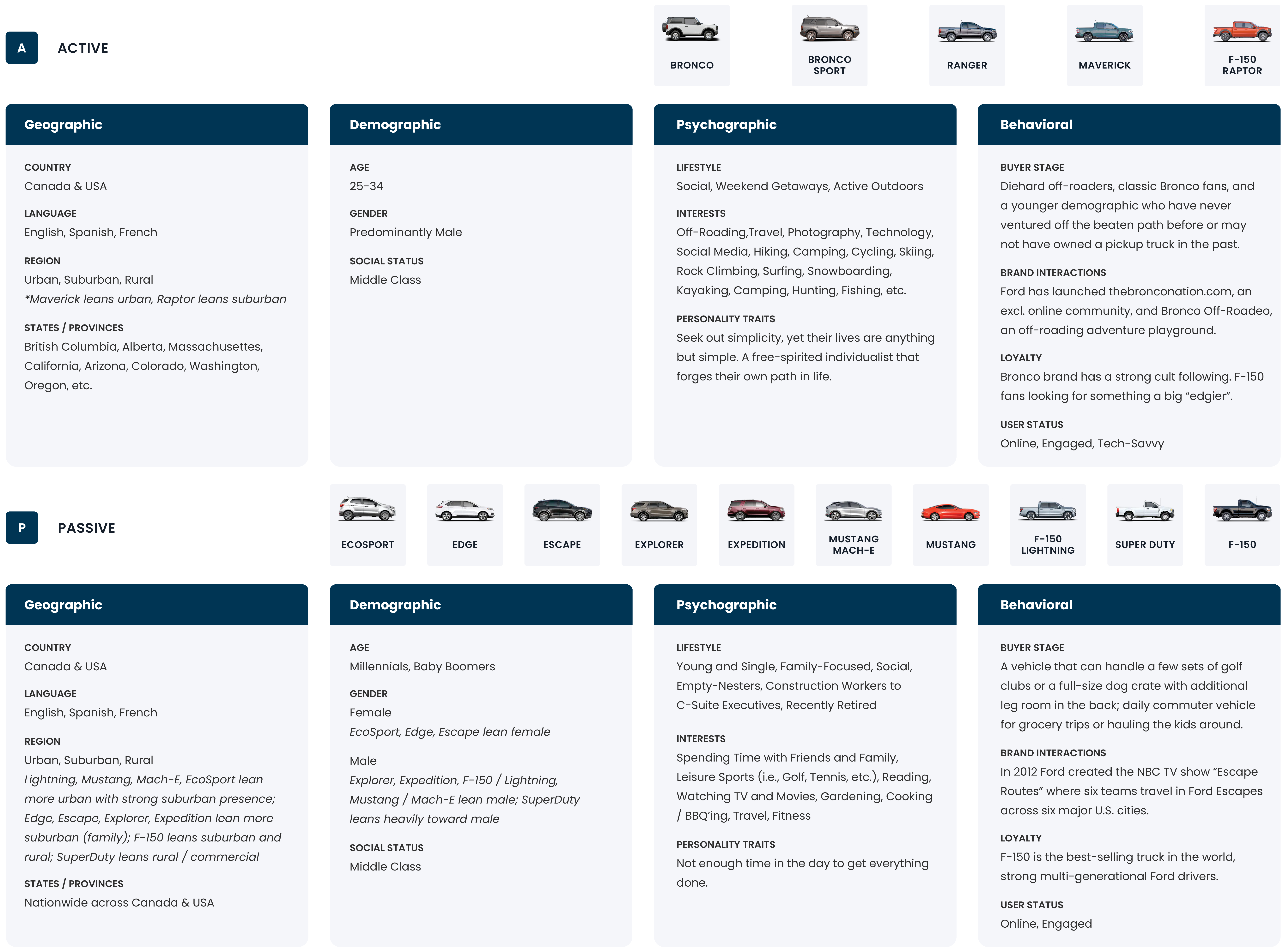
PHOTO STUDY
Leveraging Social Media to Gather Insights into Customer Behaviors and Interests
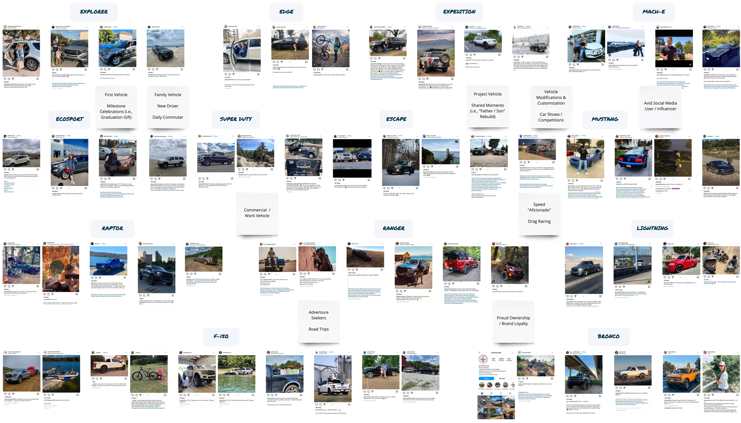
The next piece of the puzzle was to understand from the customer’s perspective the relationship they have with their Ford vehicle. A modified photo study was used to gather, analyze, and interpret images and captions posted to Instagram using the #Ford hashtag and those tagged to @Ford and @FordCanada. This approach accomplished two things: it captured attitudinal and lifestyle insights more “naturally” than formal methods, and it put a face to the customer, enabling us to meet them in their own element. What stood out was the volume of content that highlighted Ford customers’ strong affinity for the outdoors, which ultimately raised the question:

The next step was to look at ways in which people’s lifestyles could be improved or enhanced by giving them better access to their preferred activities using their Ford vehicle.
QUESTIONNAIRE
Customer Insights Lead to the Discovery of a Problem Space
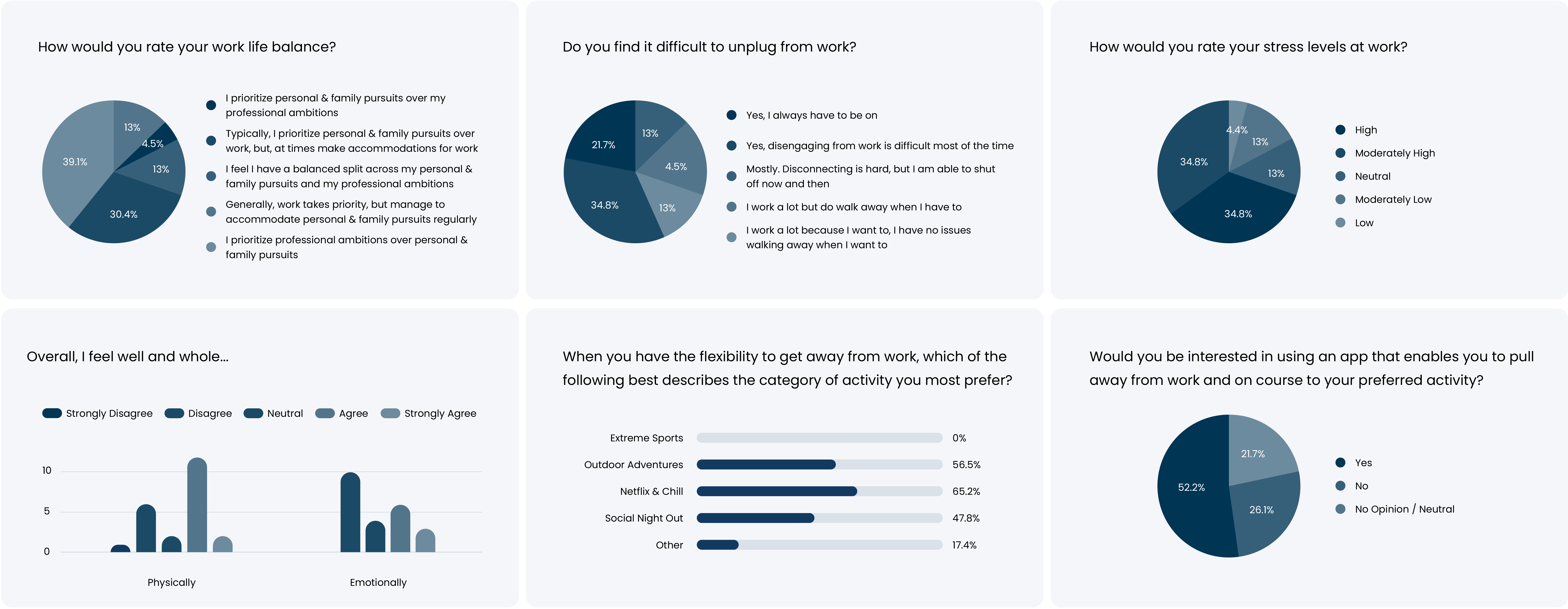
At this stage we needed to understand where and how a new product could potentially fit into a customer’s life. An explorative questionnaire was used to gather first-hand insights from drivers which explored topics related to work-life balance, and gauged the level of interest in a product that would allow and encourage them to do more of their preferred activities. Insights from 23 participants revealed high stress, unstable work-life balance, and difficulty getting away as being key problems for people, pointing us in the direction of mental and physical health as a problem area to investigate. This is where the concept for our product began to form…

Using the insights generated by the questionnaire as a foundation for our understanding, we began secondary research in order to uncover the challenges that may arise in this space—and ultimately how a new product might become a game-changer.
SECONDARY RESEARCH
Nuggets of Data Bring the Puzzle into Focus
Information from existing data turned out to be a critical component of the project. It helped us navigate from a larger and more ambiguous problem space, to a smaller and more distinct subset of the puzzle. This enabled us to identify and draw conclusions on what factors contribute to peoples’ mental and physical health challenges. Credible sources point to increased screen time as being a key factor, particularly due to the shift toward a remote working culture and spending more time indoors. Inadequate air quality was also identified as a key contributor to adverse health outcomes, and access to natural green spaces is also problematic, with research suggesting that not everyone has access to a nearby public park. With a better understanding of the problem we were aiming to address, the concept for our solution was looking promising. We decided the next step was to go directly to Ford customers to learn more about their habits, needs, and goals.
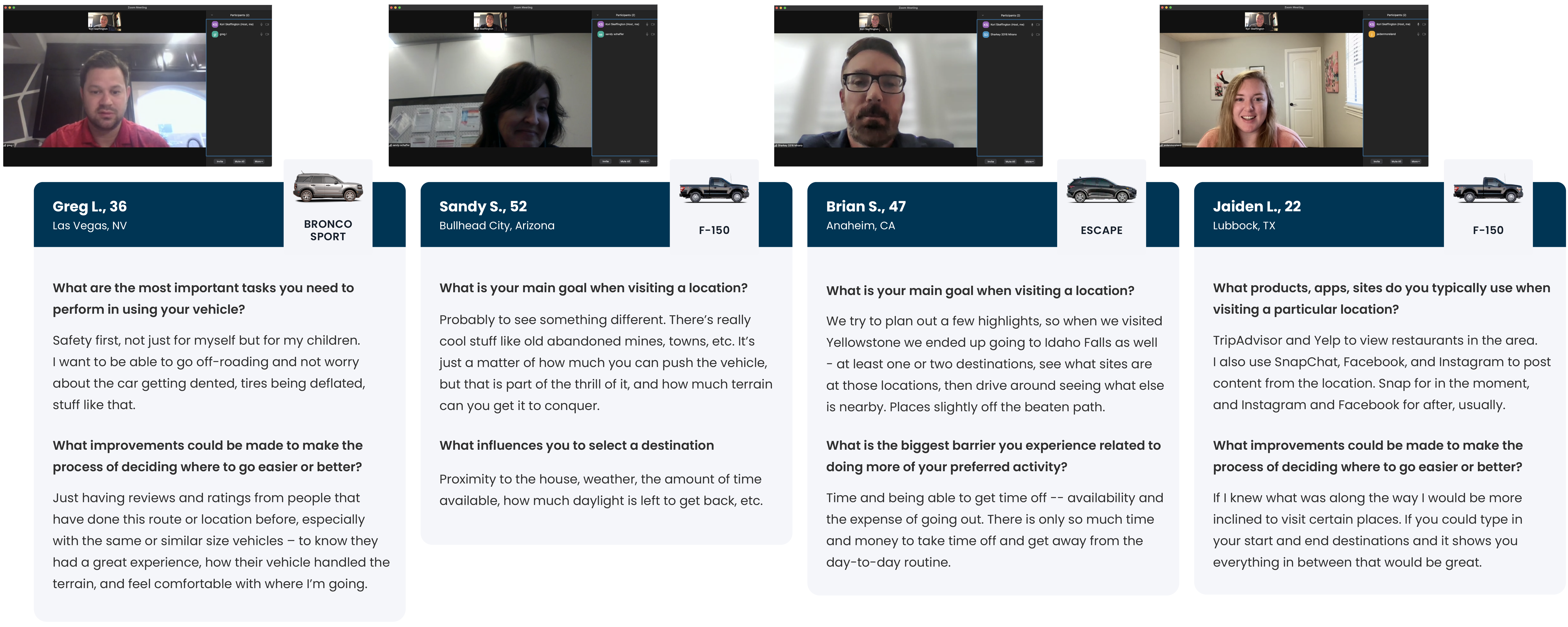
CUSTOMER INTERVIEWS
Talking to Ford Customers to Understand the Mindsets of Target Users
Customer interviews were set up using UserInterviews.com to recruit, screen, and schedule sessions with Ford vehicle owners who aligned with the demographics identified as part of our segmentation analysis. The intimate setting of 1-on-1 interviews was a successful approach in discovering how customers think and go about finding their next adventure. The information gathered was transformational in shaping the direction of our product, and was also used to inform user scenarios, personas, journey maps, flows, and product feature ideas as we continued to progress. Insights also revealed which apps and services people currently use when deciding where to go for their next adventure, which led to a competitive analysis being the final step of the discovery phase.
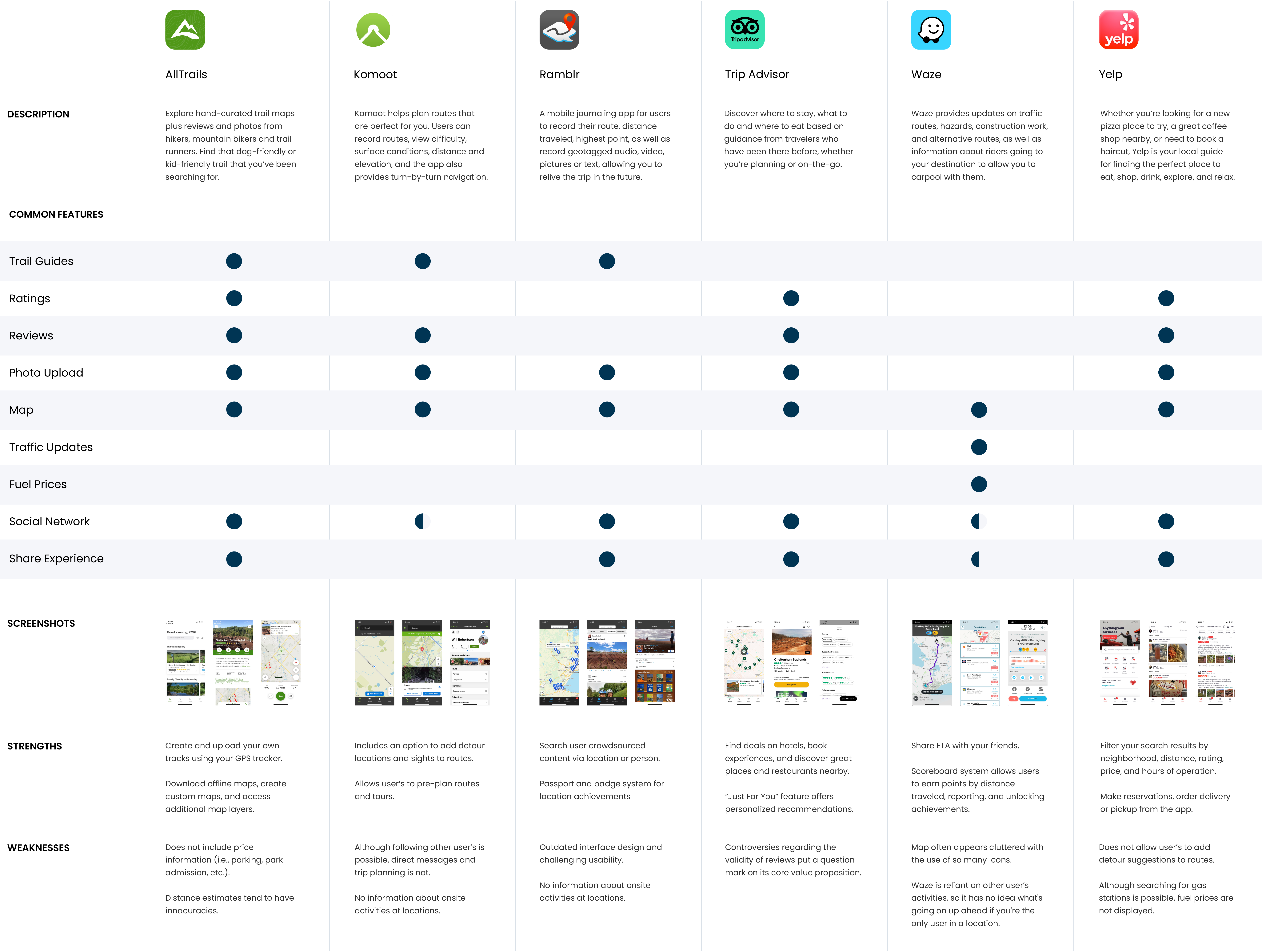
COMPETITIVE ANALYSIS
Understanding the Market and Where New Product Opportunities Stand Against Key Competitors
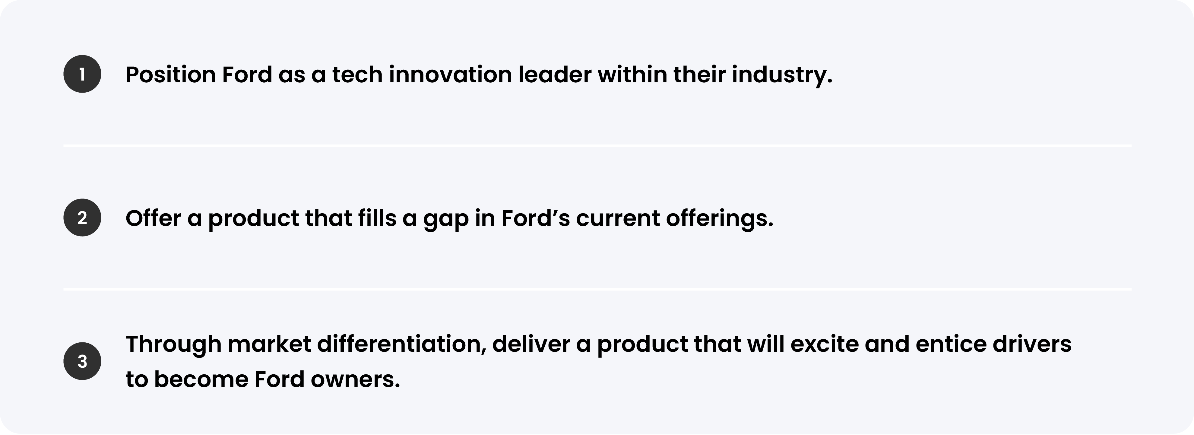
Once the team identified and committed to the idea of a product that encourages users to take a much-needed break and to go on an adventure—it was time to take a look at the current market, and similar products in the space. We studied digital services in the travel category and other related products to ensure that our concept was original and filling a real need in the market. We also looked into whether not not rival automotive companies were already offering a similar product, but our search results did not reveal any competitive products in this space. This research revealed unmistakable gaps and opportunities to attract customers from competitor products. Using this research, we formed three key goals that our solution needed to consider for the project to be deemed a success:

Define
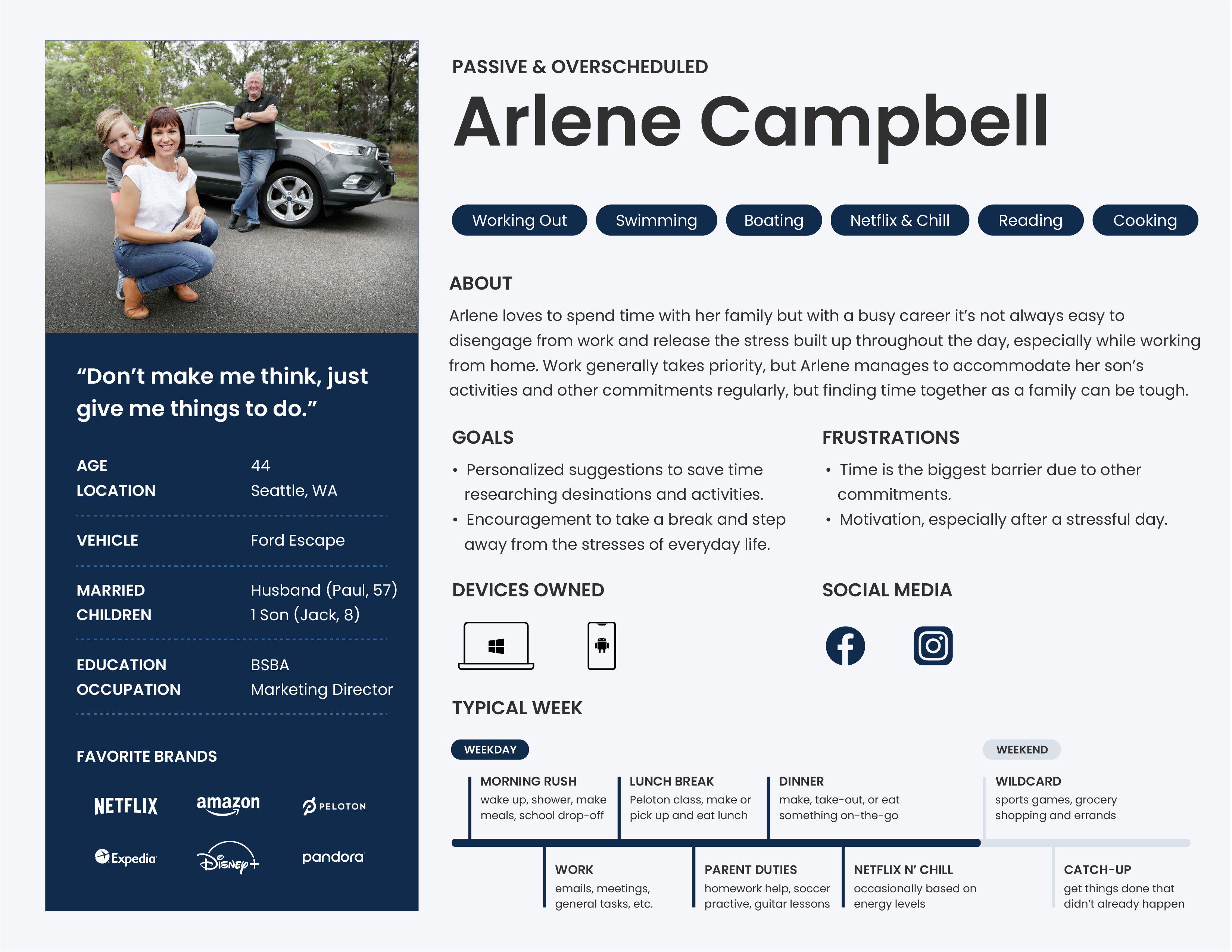
PERSONAS
Modelling Customers to Inform Design Decisions Through Storytelling
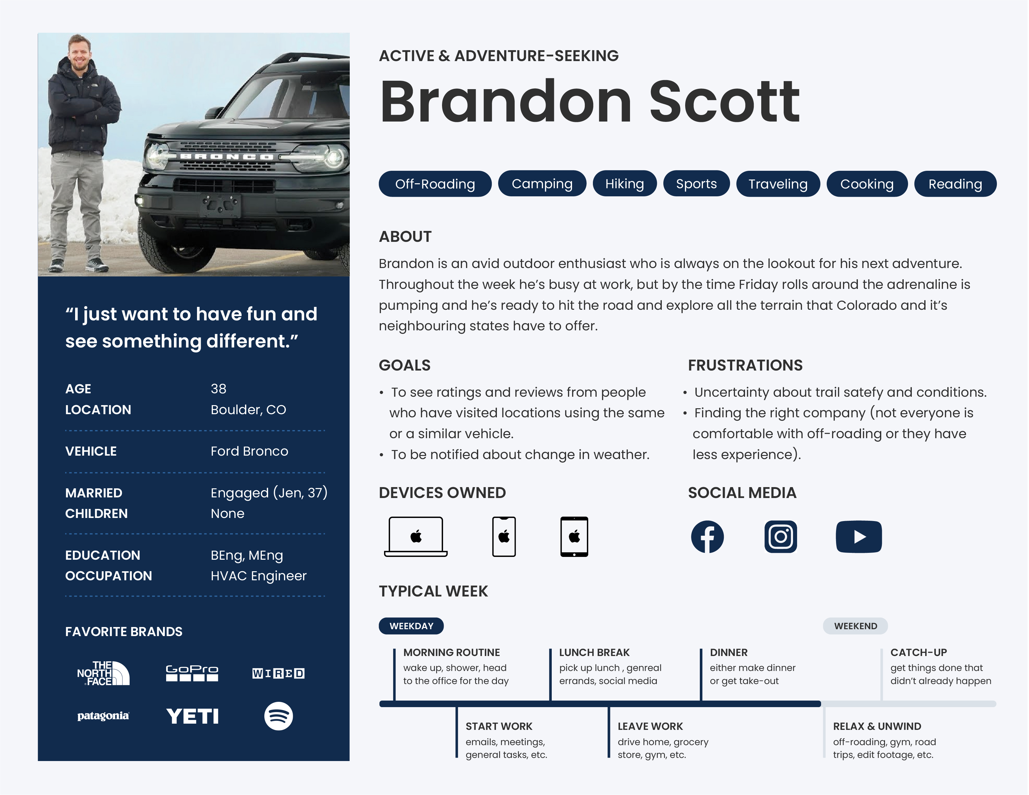
Drawing from the research compiled, personas were created to accurately reflect an ideal customer from each target segment - Brandon (Active) and Arlene (Passive). It was important that as we moved forward with the design phase, discussions were carried out with Brandon and Arlene’s needs, goals, and pain points in mind. Understanding their mindset and lifestyle habits enabled us to craft both personas to reflect how they make their decisions, where and when to reach them, which platforms and channels they use, and why they might use this product. As the famous quote goes, people ignore products that ignore people. Our personas acted as an essential tool that we were able to refer back to again and again throughout the design process to ensure we were designing features with the needs of real customers in mind.
USER STATEMENTS + MAPPING
The Role, the Goal, and the Gain: Identifying & Mapping Customer Intentions from the User's Perspective
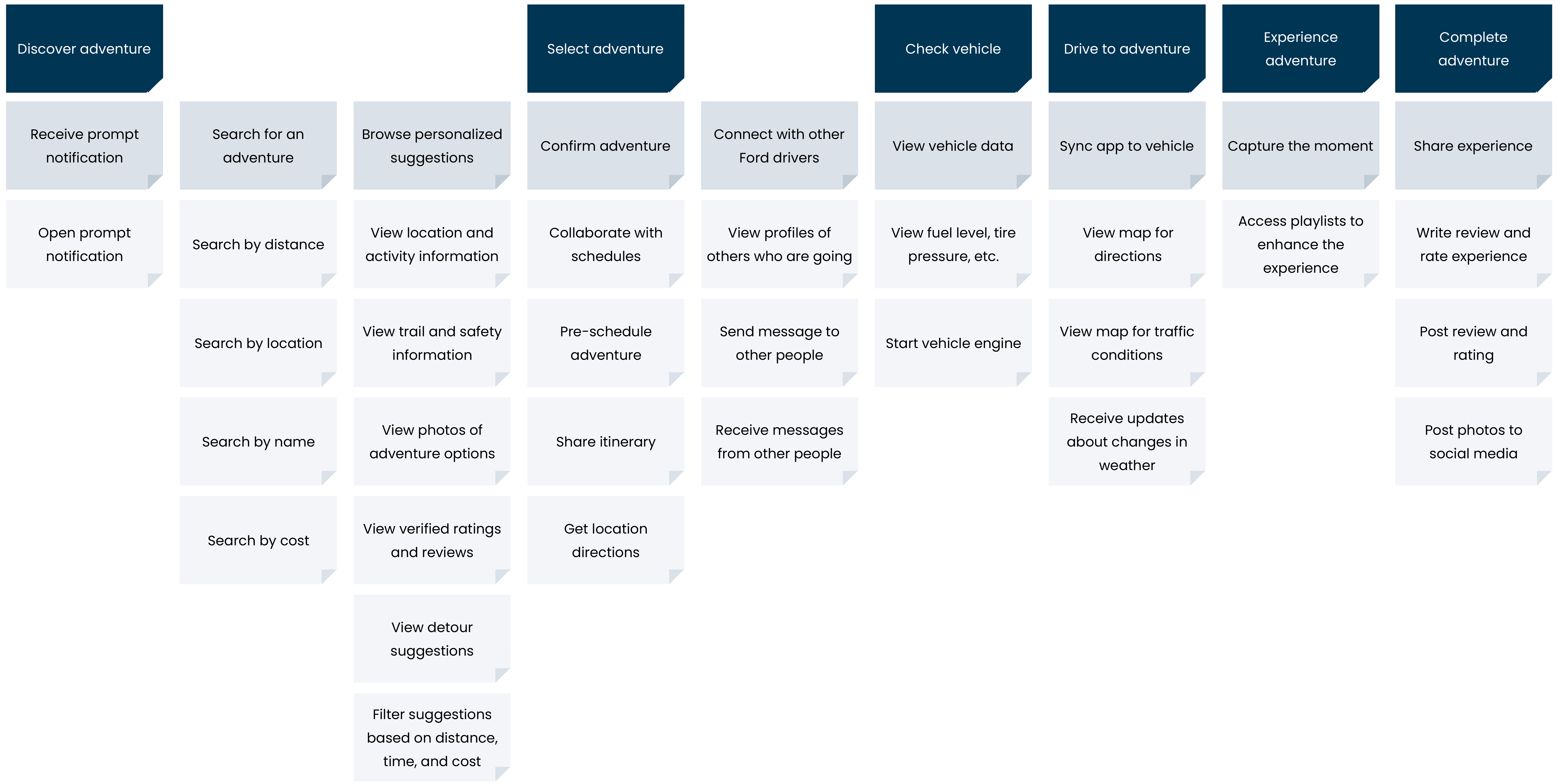
User statements and mapping were used to define the requirements of the experience by framing the customer’s role and intentions from the user’s point of view. Statements provided from questionnaire respondents and customer interviews were grouped into epics and themes, creating an overall roadmap and customer-centered backlog in one place. With every task or action that we felt the product needed to perform, there was a rationale from a user standpoint to justify key features and to guard against basing design decisions on our own preferences and biases.
JOURNEY MAPPING
Representing Users’ Motivations, Behaviors, and Challenges to Identify and Craft a Desirable Product and Experience
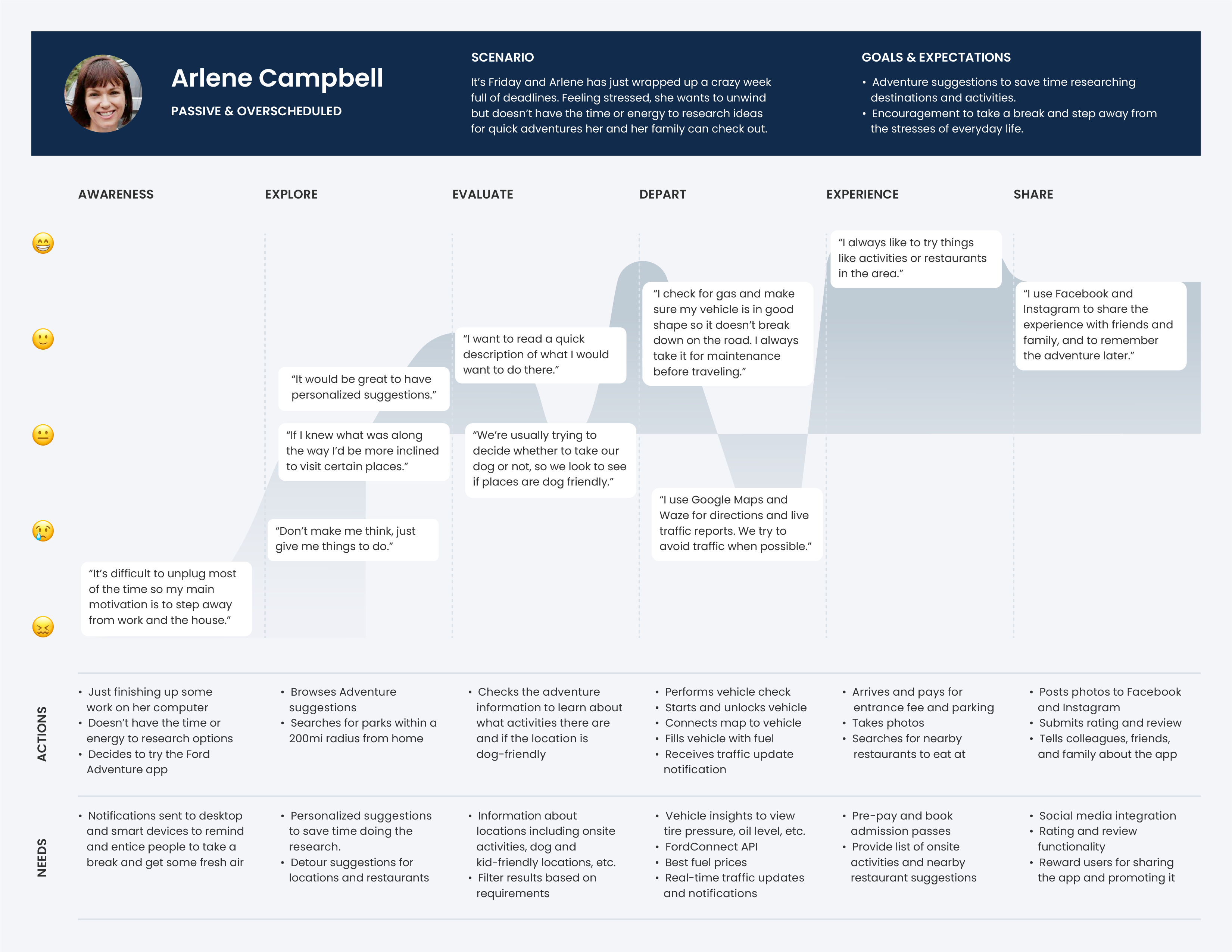
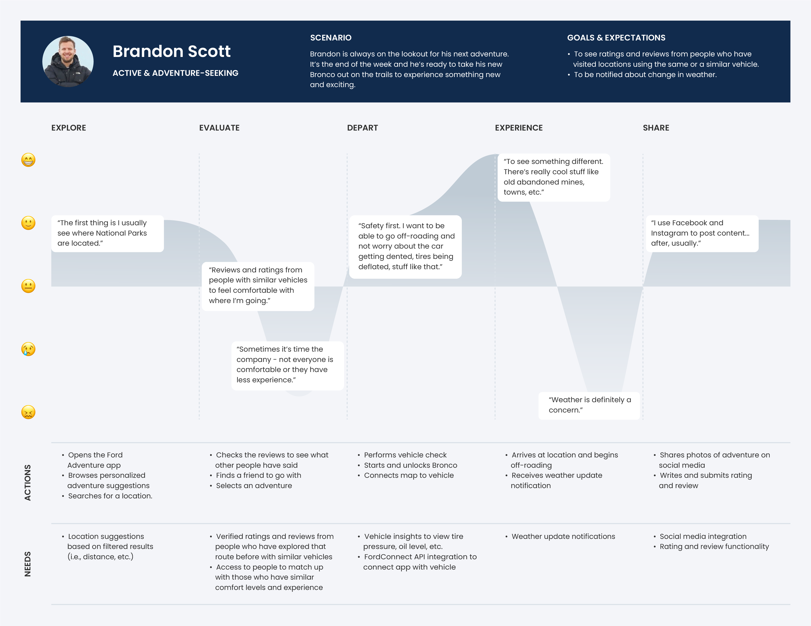
To construct the narrative of the customer’s experience, two journey maps were created to visualize and understand how someone might engage with the product through the lens of the user. Drawing from insights gathered during the interview stage, we mapped out the journey for each persona from both an active and passive perspective – those who seek out their next adventure, and those who need a reminder to take a break and get outside. This holistic visualization informed different user flows we explored, feature ideation and placement opportunities, as well as highlight where we needed to shift the design strategy from a user-first approach to driver-first approach once someone gets in their vehicle.

Ideate
BRAINSTORMING
Using “How Might We” Questions to Provoke Meaningful Dialogue
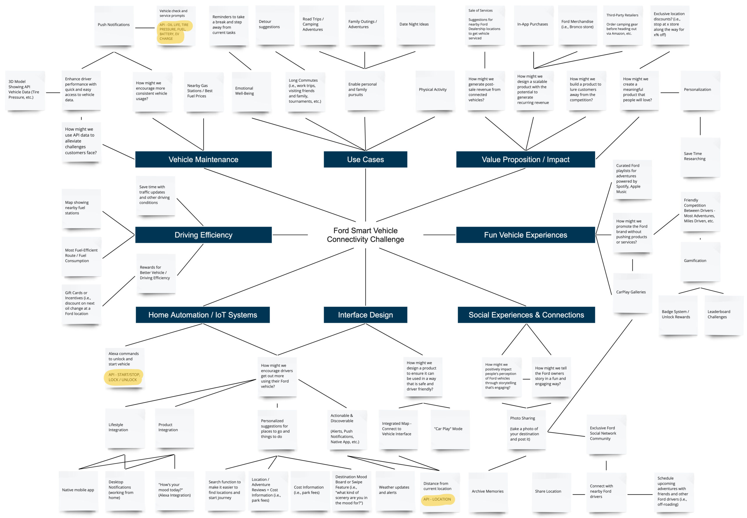
To kick off the ideation phase of the project, we used Miro and Zoom to support a workshop of team activities, the first of which was a brainstorming session. Throughout the research and analysis process, we framed different thoughts and areas of inquiry in the form of “How Might We” questions to review once we arrived at this stage. This proved to be beneficial in guiding discussions and mapping out potential product features against the different areas of exploration presented by Ford, as well as against the needs of each of our personas. This also helped us group all the research insights together to identify themes and connections, and for everyone to see, view, and discuss from different perspectives. Further to this, we were also able to identify areas where the API data could be utilized, and generate the overall framework of our solution. Our primary goal was to ensure that our solution didn't function as a novelty product, but one that provides value to both the business and consumer.
LIGHTNING DEMOS
Gathering and Sharing Visual Inspiration to Guide Product and Design Decisions
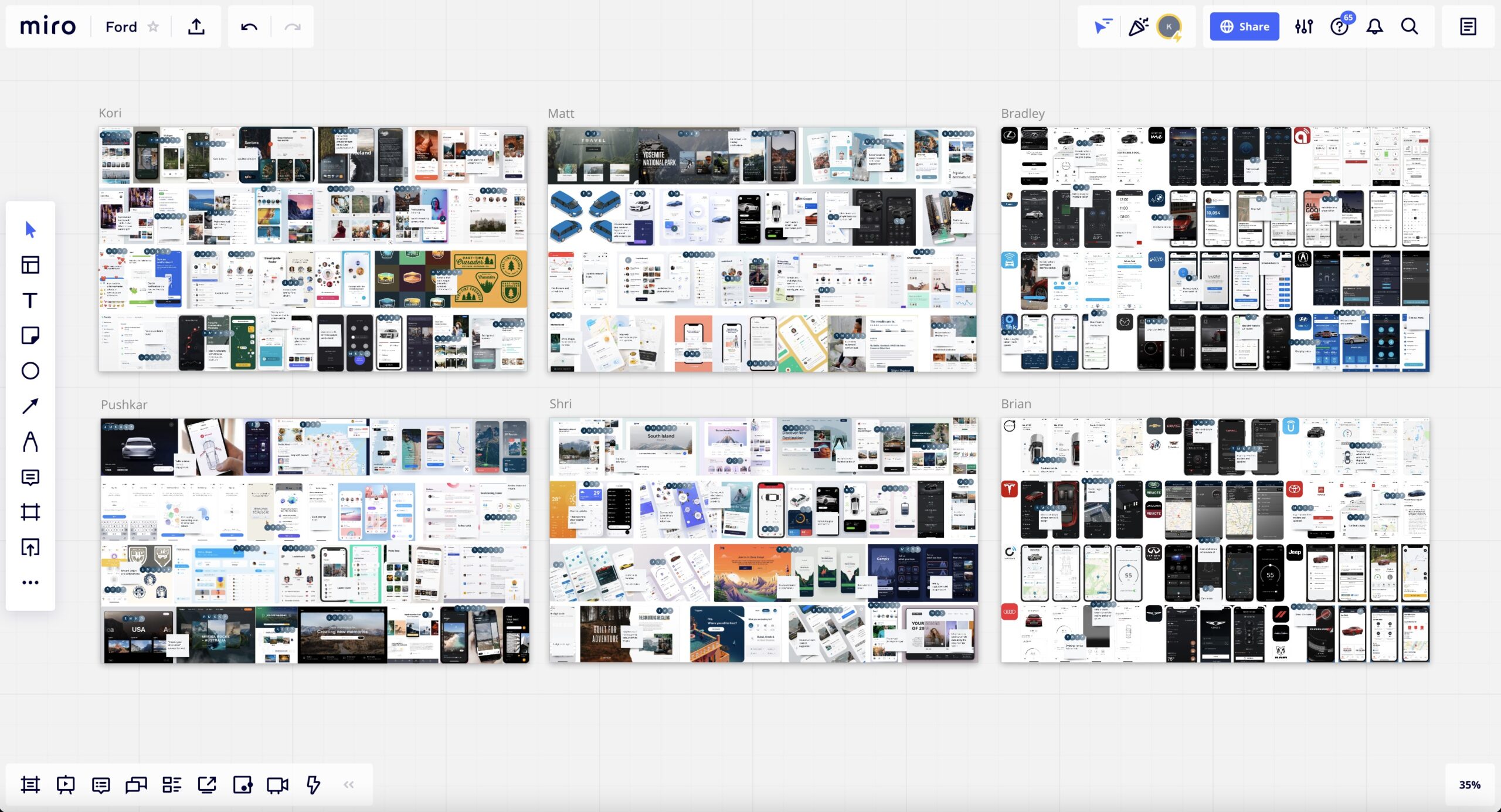
Excitement and momentum really started to build as the team became engaged in the process of crafting our solution together. The Lightning Demos method offered the perfect platform to collaboratively influence the visual design aesthetic by looking at and gathering ideas and inspiration from existing products in the market, then discussing and individually dot voting on the most important design ideas and features to develop. A collage of pictures, illustrations, and brand imagery were gathered and used to serve as a visual definition or reminder for design focus, and as a consensus artifact for the team. By working together, the design process was made easier, and faster, with everyone following a shared vision.
CRAZY 8'S
Communicating and Thinking Through Paper: Generating Innovative Solutions as a Team
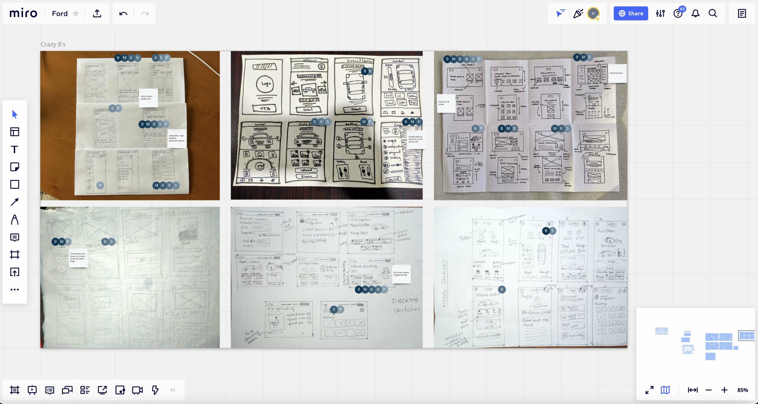
The next step was to start sketching potential ways to design our product. Instead of presenting low-fi sketches to the team, a collaborative, fast sketching exercise was used. The rules were simple: the best ideas win regardless of the source, and quantity over quality was key. This divergent approach helped us quickly iterate, discuss, and learn from the perspectives of others what design strategies were optimal given the amount of time available, and it also resulted in some fantastic "idea seeds" to grow into something special as we continued to move along. Although some members without a design background were a bit intimidated to contribute at first, believing their “chicken scratch” drawing skills were too poor to interpret, reassurance that these were just rough sketches and the more we have the better resulted in a wide range of ideas to build upon. Looking back, this ended up being one of the best exercises we worked on together in terms of team building and outcome.
MOSCOW METHOD
Utilizing a Categorical Framework to Prioritize Features and Determine MVP Requirements
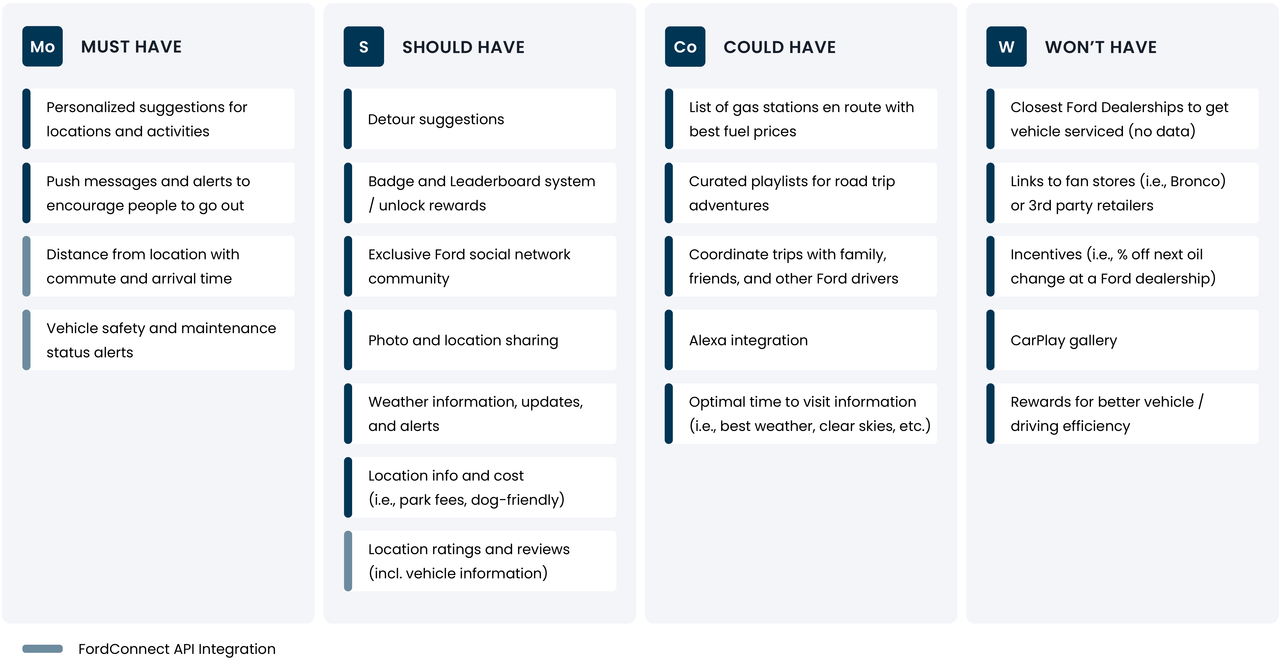
To determine which features we needed to include and which ones were too complex to develop with the deadline approaching, a MoSCoW framework was used to prioritize Must have, Should have, Could have and Won't have criteria. This approach helped guide user needs, business requirements, and creative strategy into the robust experience we were striving to construct, and provided a structured process that was used to establish definitional boundaries of the project and product requirements.
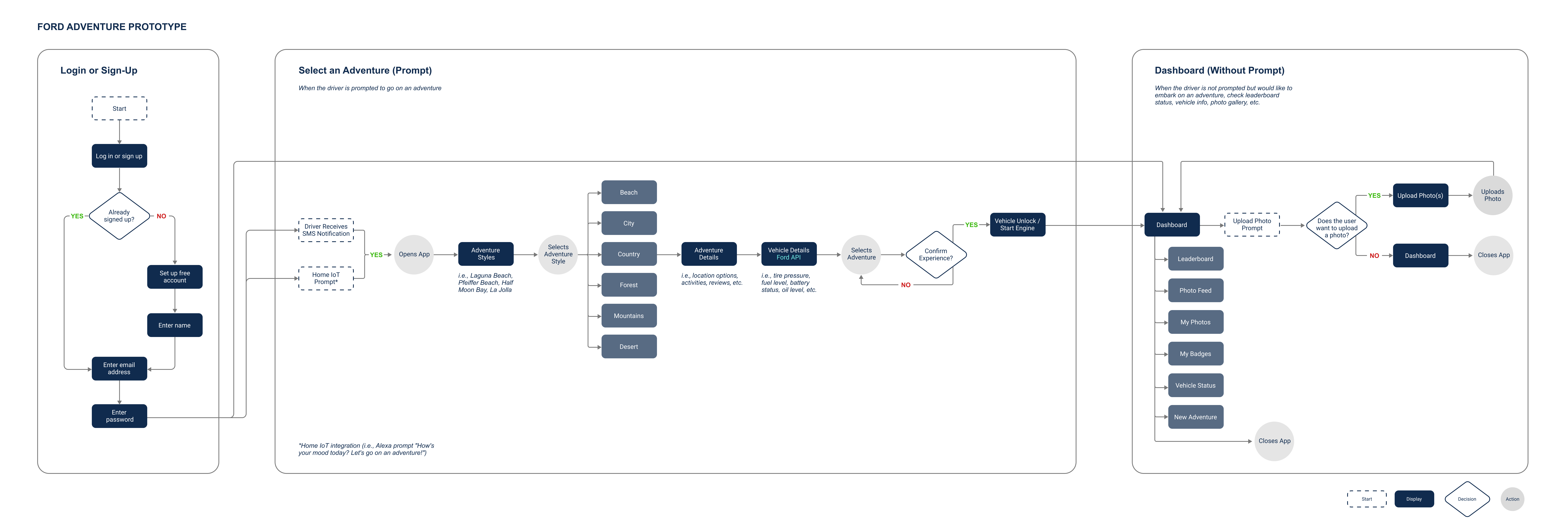
USER FLOWS
Crafting an Intuitive Experience to Help Customers Accomplish Their Goals
The next step in the process was to craft the user flow based on the two journeys we identified. We decided to focus on the Passive customer experience as our primary target for two key reasons:

Targeting the Active segment was also prioritized, but with consideration towards delivering quick and easy access to location suggestions without the need for encouragement. The initial flows were created independently, then presented to the team to gather feedback and input. Depicting this process allowed us to collectively evaluate and discuss the optimal user experience based on the different requirements of each customer journey, and identify where different use cases could intersect to meet the needs of both user segments.

Prototype
PARALLEL PROTOTYPING
Using Simultaneous Exploration to Bring an Innovative Solution to Life
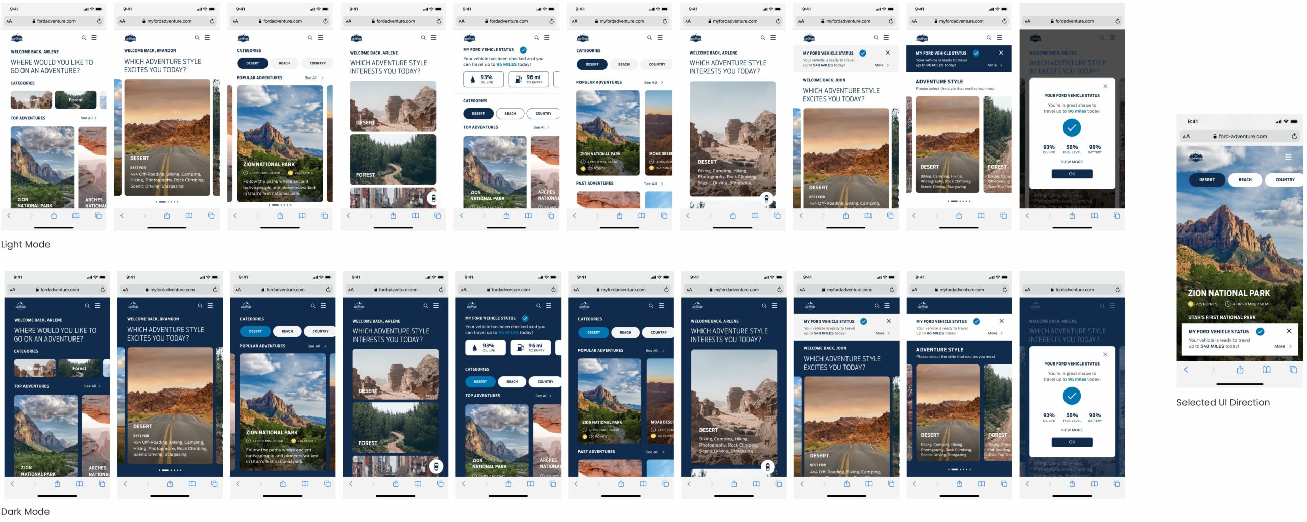
At this stage we needed to re-evaluate the project scope now that we were a six member team. The companion Android app was no longer an option, and in the interest of time, we decided to design for mobile first with the intention of building the desktop screens should time allow for it prior to the deadline. There was always room to iterate later, and since it’s easier to scale up rather than scale down, we wanted to ensure we had something to submit. We decided to use parallel prototyping to explore multiple design options at once, evaluate them as a group, then hand them off for development while the next group of screens were being designed. This approach opened the doors to engage the team in a design critique to gather input about aesthetic preferences, limitations and constraints, and ultimately execute a solution that everyone felt invested in. We were able to lay the groundwork by finding a balance between time and implementation. In an ideal world early user testing at this stage would have been beneficial, but with only a few weeks left, and with the judging criteria of the challenge considered, we decided to take our chances and forgo this stage to leave more time for the development itself.
SUBMISSION
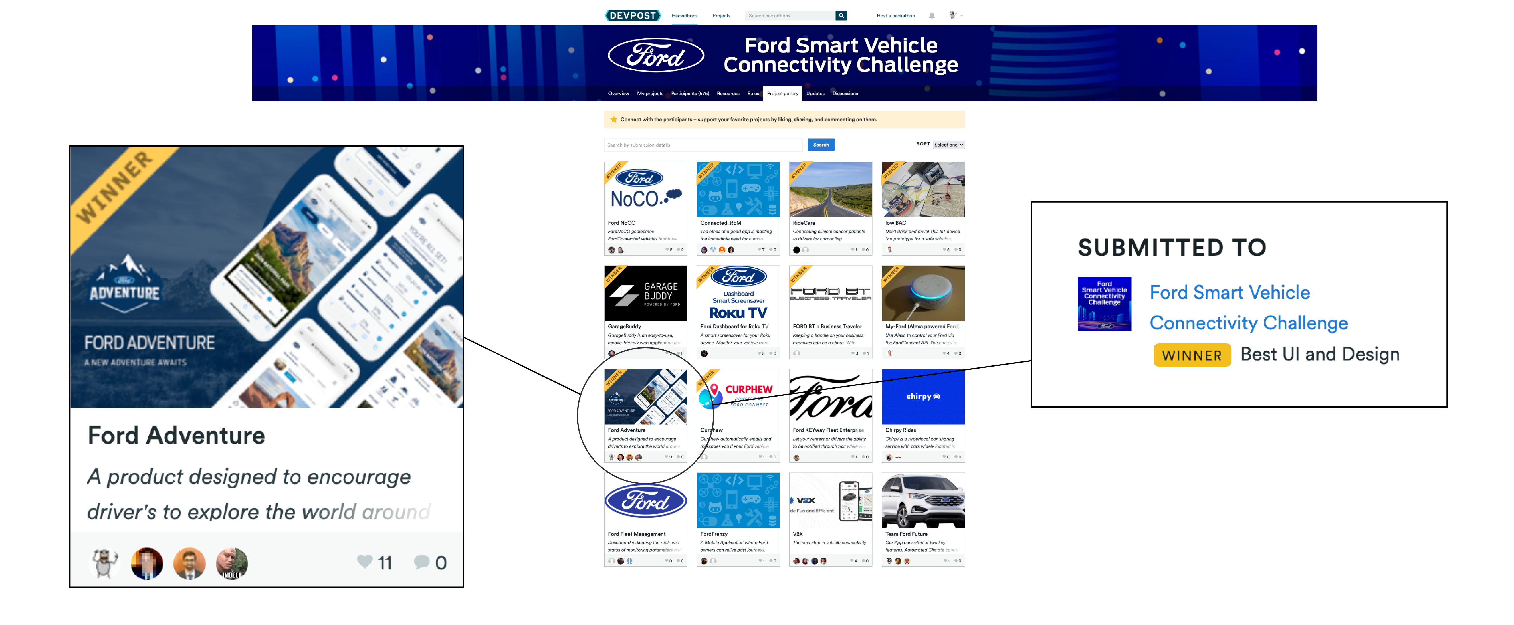
Ford Adventure Wins for Best UI & Design!
When the winners were announced we were thrilled to learn that Ford Adventure was selected for the prize of Best UI and Design. We were truly blown away by the outcome, not only because it showed a level of appreciation for the solution we identified to a complex problem space, but because of how much it meant to all of us for our work to be recognized by such an iconic company and brand. By the final development phase our team had dwindled down to just four members, and even submitting a functional mobile solution became a 24/7 effort on everyone's part. By the end we were definitely sweating bullets to finish just the mobile screens alone, so for the project to have such a positive outcome meant everything to us. Not only did we have an amazing time together and build new friendships, but sharing such an impressive victory together really added to the experience for everyone.

Test
USABILITY TESTING
Identifying Changes Required to Improve User Performance and Customer Satisfaction
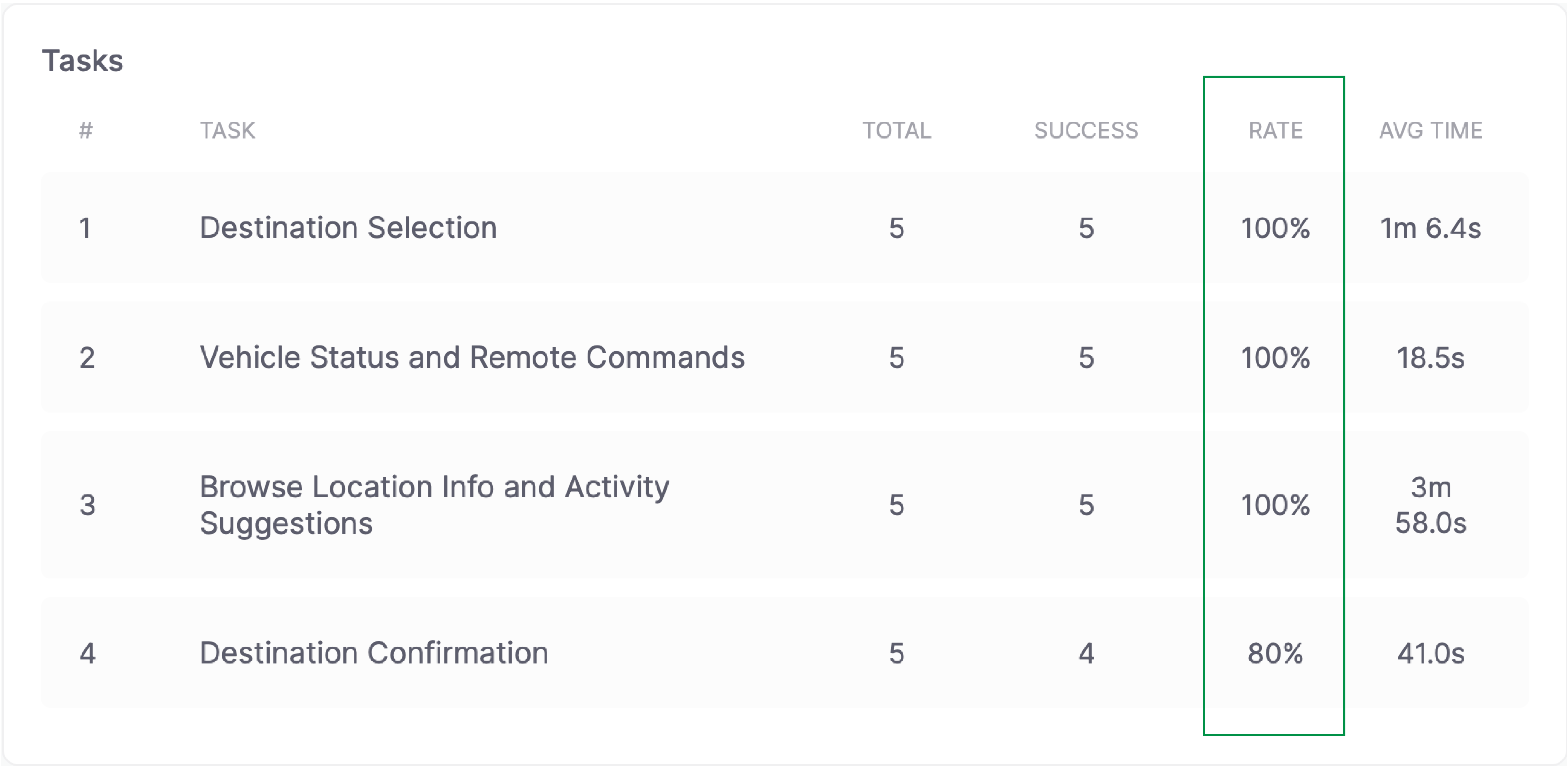
Working backwards from a fixed launch date meant that the original design was subsumed into an engineering‐driven process. After submitting the app to the challenge, I decided to take a step back and run an initial usability test via Useberry to evaluate the task success rate of the original design, and to identify what works and what could be improved upon. The outcome revealed an overall 40% task success rate. It turns out the full screen images did not have the desired effect we were hoping for and only created confusion, and while we assumed the vehicle status card would be an ideal way to display the vehicle being ready for travel, users struggled to locate their vehicle information once it disappeared.
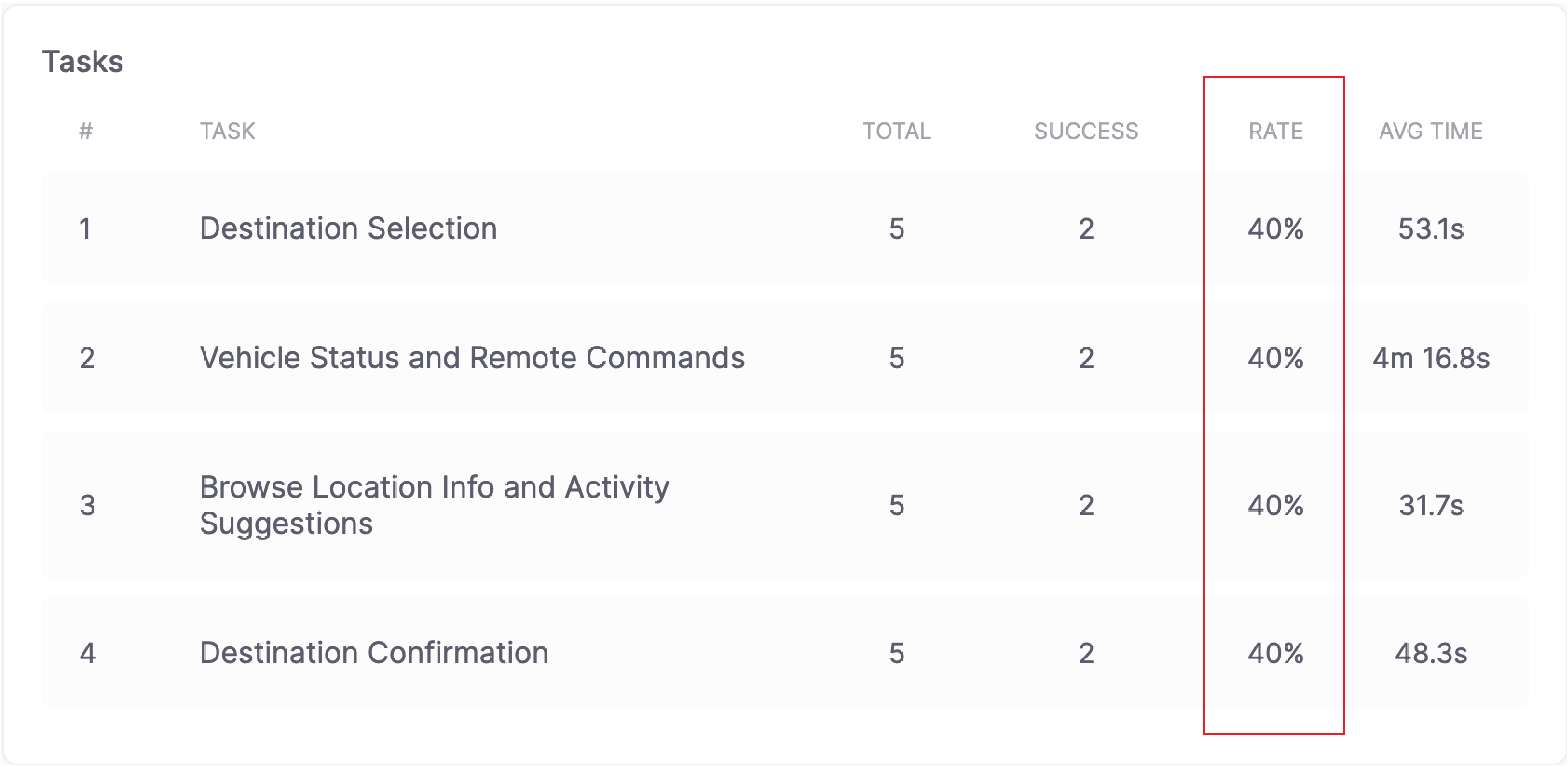
After Ford Adventure 2.0 was created, a second session was scheduled using the same tasks and the same number of participants to determine whether the revised solution showed significant improvement. When the results came in I was delighted to see an overall 80% task success rate! It was clear that the new interface design was on the right path and showed that users were successful in achieving the product’s core goals and objectives.
REVISED PROTOTYPE
Design Iteration Delivers Powerful Results
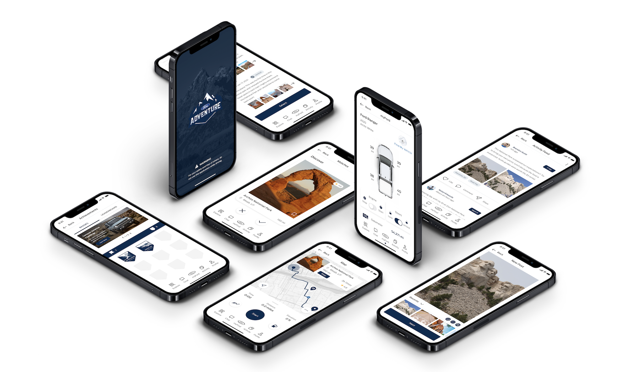
After reviewing video playback footage, heatmaps, and participant feedback, a revised prototype was created to address the challenging usability issues the initial product contained. The decision was also made to switch from a web-based app to a native mobile app based on participant feedback and greater opportunity to offer a more intuitive and interactive user experience. The updated design introduces a tab bar along the bottom of the screen to provide the driver with quick and easy access to their MyFord vehicle statistics and remote commands, an Explore icon to access a range of adventure options, as well as Chat, Activity, and Profile access. The interface also integrates more white space into the design, eliminating the use of full images, which made the swiping process and locating information more intuitive for the user.
BRAND & DESIGN SYSTEM
Crafting a Product to Foster Brand Affinity and a Desirable User Experience
With the Spirit of the great outdoors in our hearts, the Ford Adventure logo was the first brand asset created. Taking cues from the Lightning Demos, and gathering inspiration from the trees and mountains themselves—the logo is intended to invoke the feeling of freedom in our target audience. Bold, fun, confident—these words can be used to describe Ford Adventure, and its users. With a nod to classic Ford style with the iconic blue and white—the logo offers the instantly identifiable hallmarks of a Ford product.
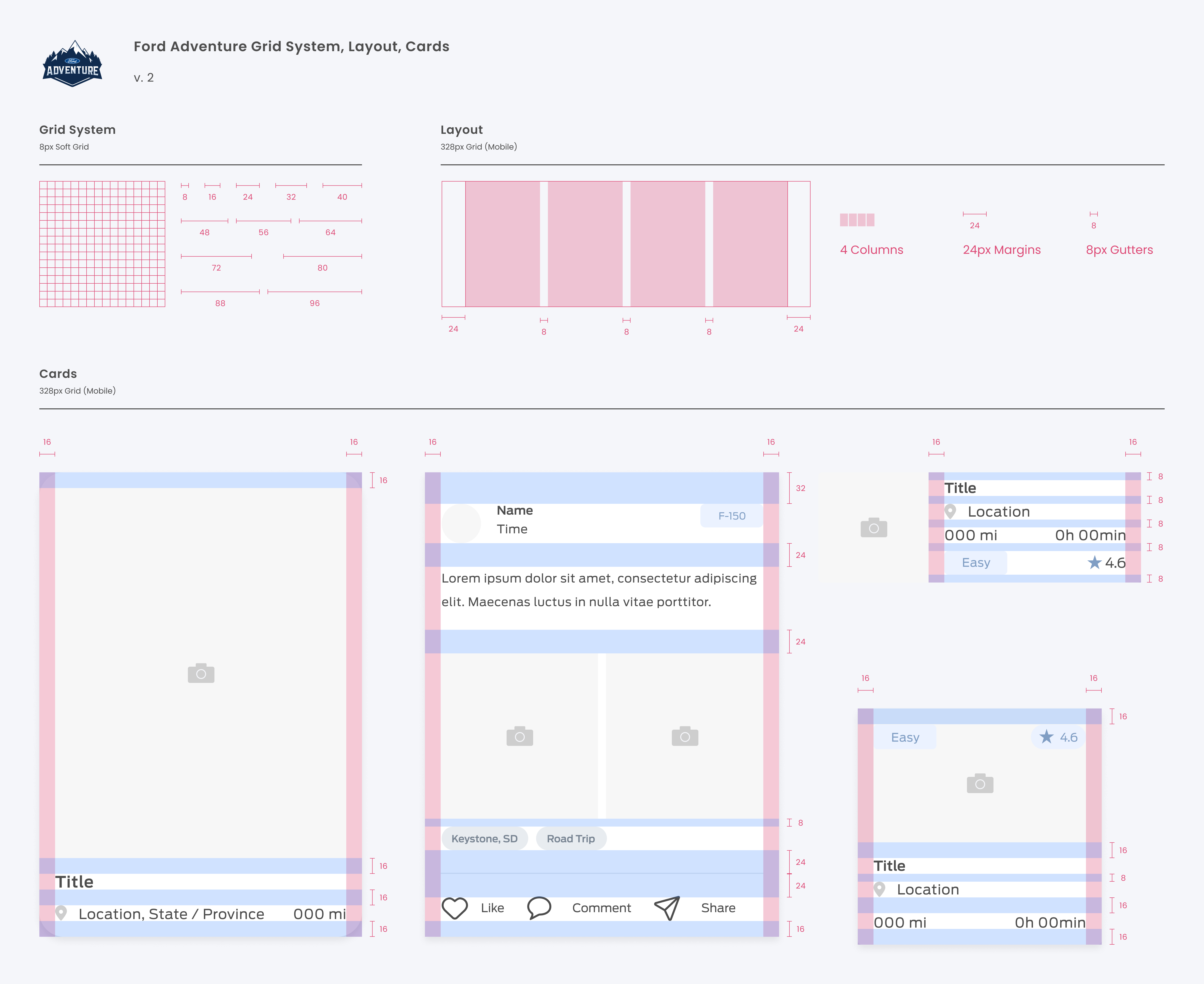
The Ford Adventure interface itself is unmistakably Ford and also original in its own right. The undeniably fun, confident, and daring design is intentional, meant to reinforce and enhance brand recognition, while differentiating from the competition. Components unify both design and development with the same visual design language. The design system utilizes an 8px grid system, and incorporates a range of cards to scale perfectly across different screen displays. In both design and practice, a user-centric approach was taken.
Outcome
KEY FEATURES
An Engaging Solution for our Mental and Physical Wellbeing
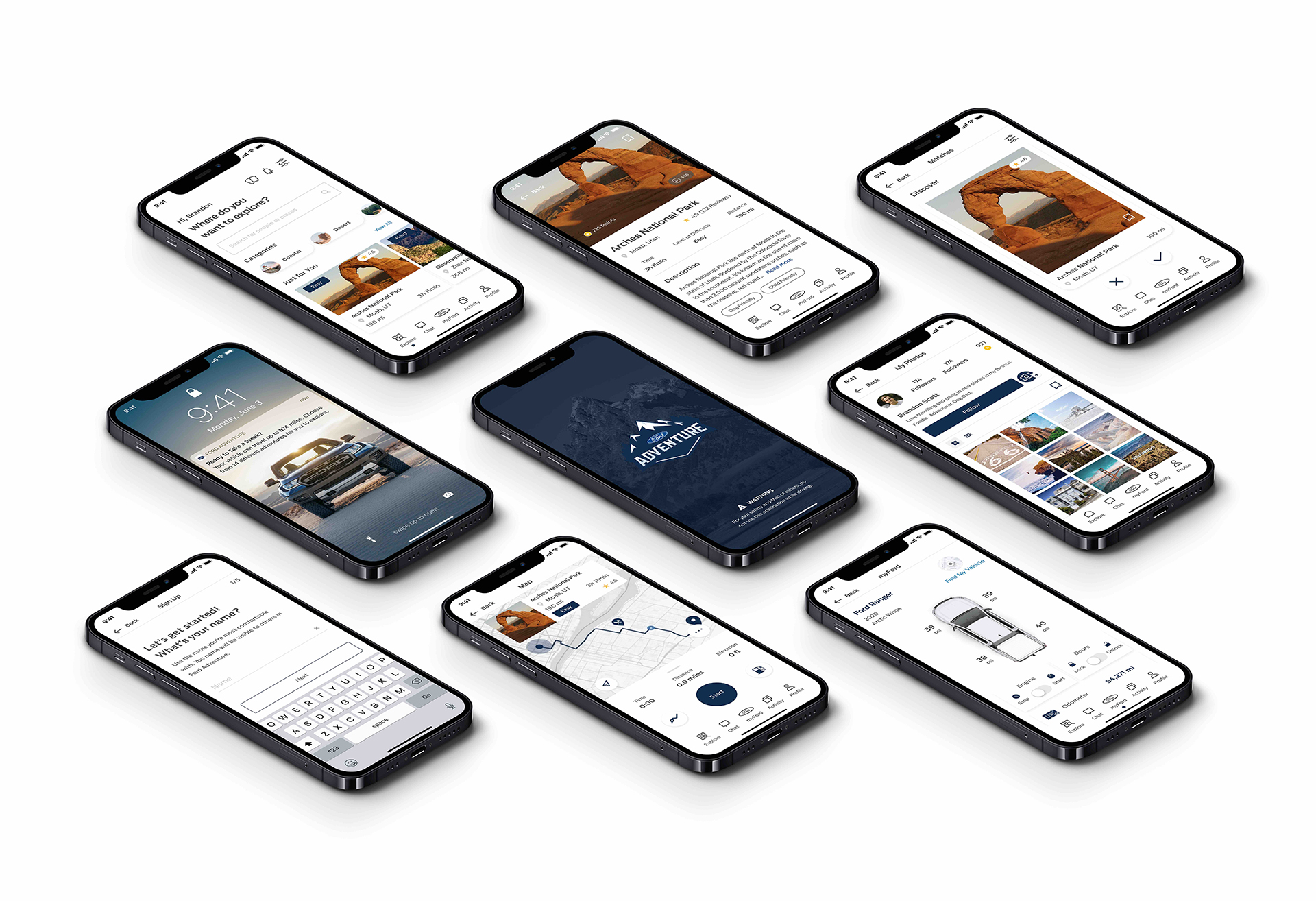
In times of increased stress and anxiety, the great outdoors has become a great escape away from the glow of screens at home. Hiking trails, parks and other open spaces offer cooped-up individuals and families a chance to reconnect with nature to escape from the stress we often feel in our day-to-day lives. Our solution, Ford Adventure, is the introduction of a new product concept designed to encourage Ford drivers to get outside and explore the world around them using their vehicle. By leveraging the FordConnect API data, we were able to design an innovative solution to better support the needs of customers and improve their personal well-being. Key product features include:
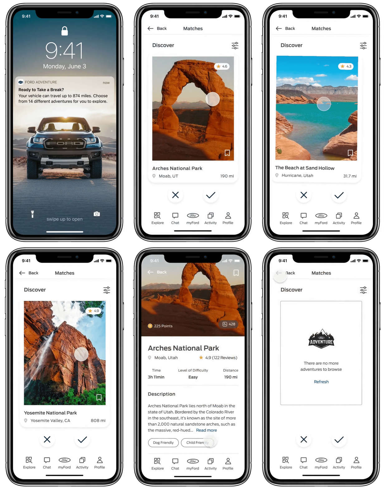
Discover Adventures with Ease
A healthy lifestyle shouldn’t be complicated. It should be automated. Drivers can opt-in to receive push notifications reminding them to take a break and get outside. Swipe left or right to browse adventure suggestions based on the radius their vehicle can travel according to its current fuel level, oil life, battery charge, etc.
Drivers who wish to use the app without being prompted can easily explore suggestions suited to personal preferences, most popular, most viewed, and most scenic from the "Explore" screen.
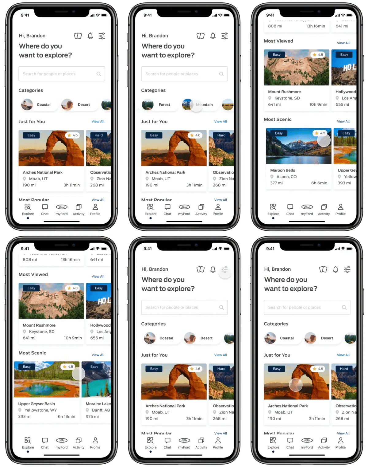

FordConnect API Integration
Drivers can check their vehicle status at any time to feel confident and assured that it's safe and ready to hit the road, as well as access remote commands making it easy to unlock and start your vehicle before leaving the house.
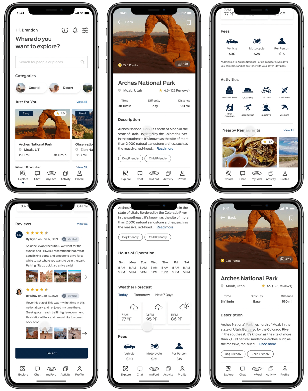
In-Depth Location Information
Save time doing the research by accessing in-depth location details including the weather forecast, fees, onsite activities, nearby restaurants, and verified reviews.
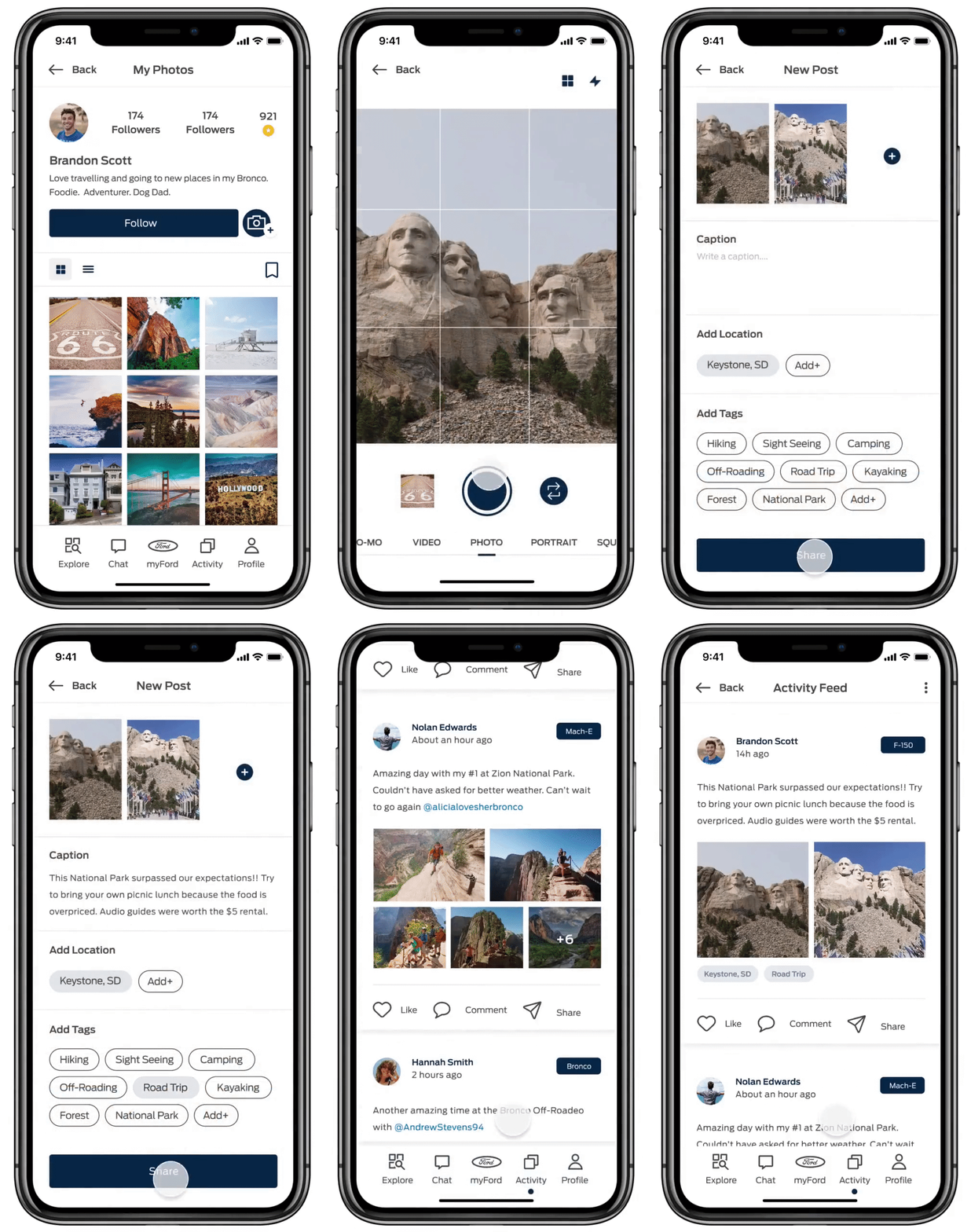
Share the Adventure
Upload a photo from your chosen destination and share the adventure with other members of the Ford community.
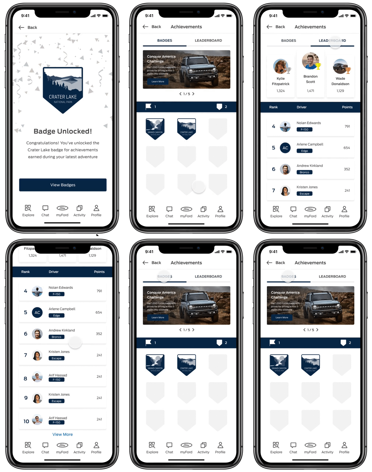
A Gamified Driver Experience
To motivate drivers to use the app on an ongoing basis, users can earn points and "merit" badges for locations visited, selecting longer distances, uploading photos, and engaging with other drivers within the Ford Adventure community. Badges are meant to be desired, are designed to harken back to childhood scout badges.
LEARNINGS & TAKEAWAYS
Learn, Adapt, Pivot, Grow
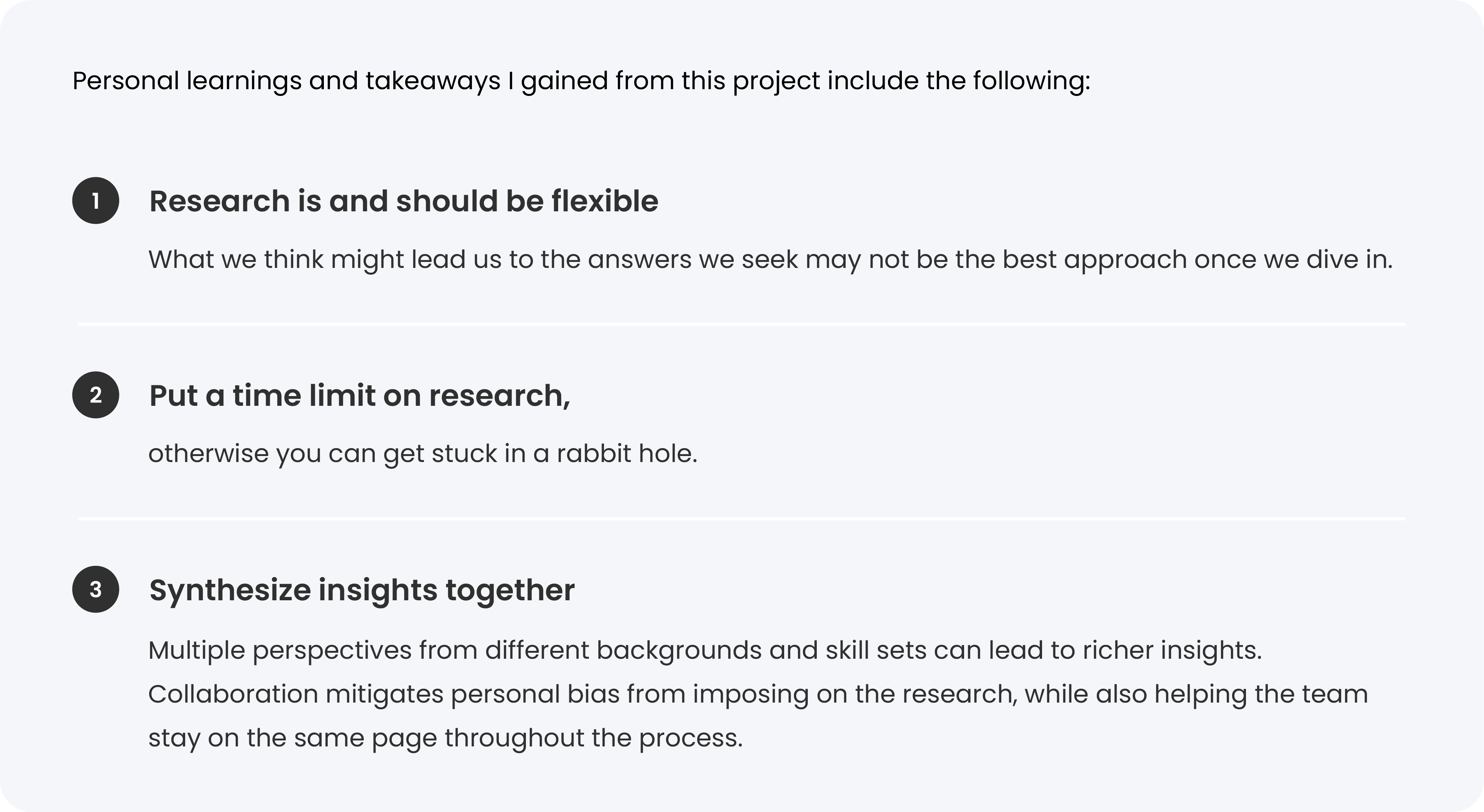
Every new project delivers a wealth of knowledge and learnings that help us grow as professionals in our fields. The Ford Smart Vehicle Connectivity Challenge presented us with an opportunity to explore the world of vehicle connectivity in a way that challenged us to think about how we can better utilize vehicle connectivity technology to create improved outcomes for drivers. We believe that in order to impact the customers and communities that Ford products serve, we need to champion new and innovative technologies to create meaningful experiences that solve real user problems.
Although the process to reach our final solution was not an easy one – from team members disappearing to the challenge of using a new stack, and also the struggle of managing neverending scope creep – our experience led us to build new friendships and grow as professionals in our fields, all while having fun.
KORI SKEFFINGTON
© 2021 All Rights Reserved
CONTACT
SOCIAL